Summary Report
Opening a Summary Report
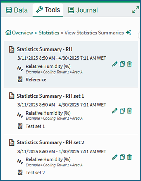
Figure 1a
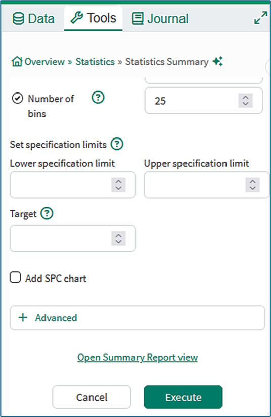
Figure 1b
Summary Reports provide a means of working with Statistics Summaries. They can be accessed from the Statistics tool.
The Summary Report tab opens when a user clicks a saved Statistics Summary in the View Statistics Summaries tool.
The Summary Report tab can also be opened from the Statistics Summary tool by clicking the Open Summary Report view link or the Execute button at the bottom of the user interface (Figure 1b).
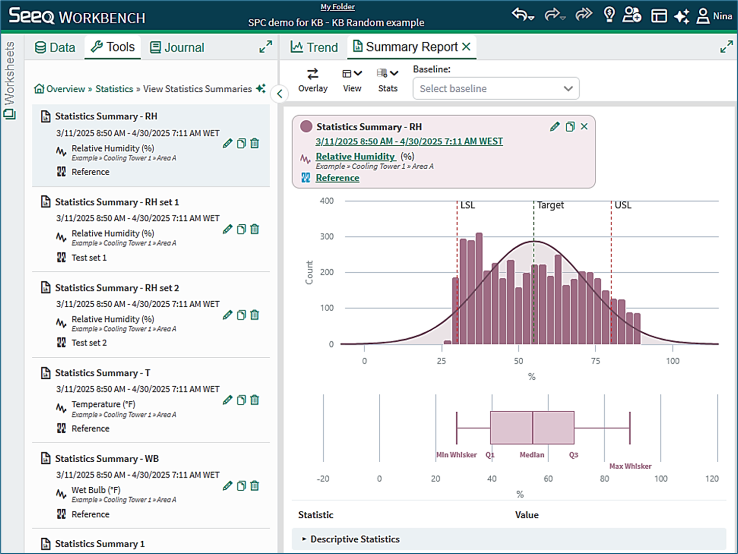
Figure 2
Tabbed viewing
The Trend and Summary Report tabs can be opened side-by-side using flexible layouts ("Seeq Your Way") to drag the Trend and Summary Report tabs into new docked positions, as shown in Figure 3.
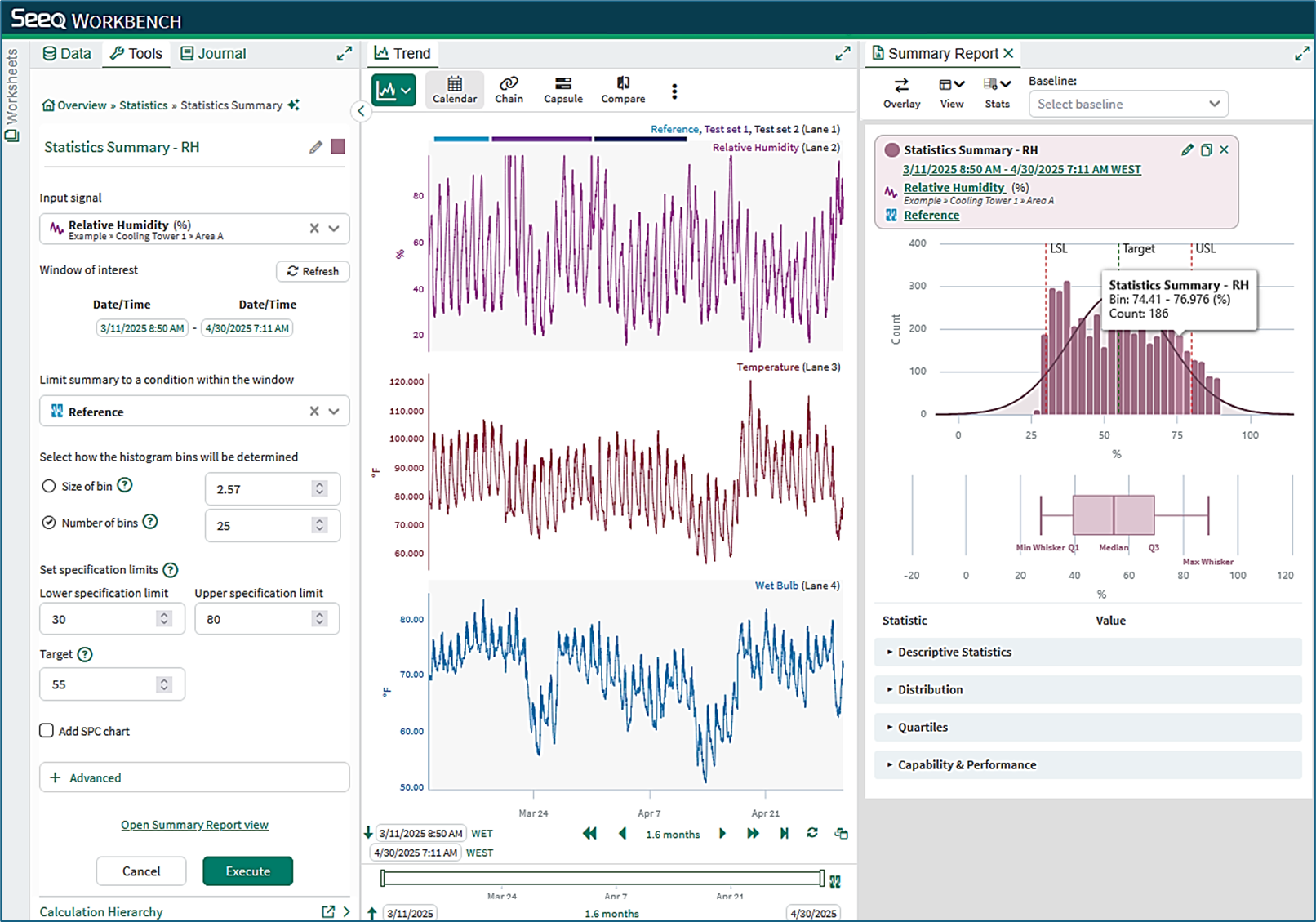
Figure 3
Summary Report controls and configuration
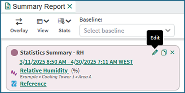
Figure 4
Action icons
Statistics Summaries can be edited, duplicated, or removed from display using the action icons in the title card. Hovering the mouse over an icon gives a tool tip for each action.
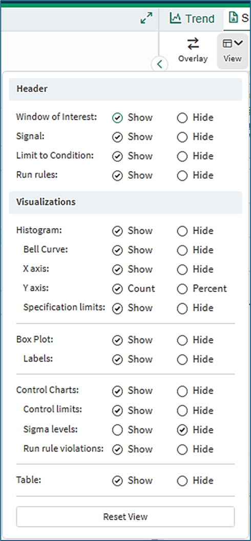
Figure 5a
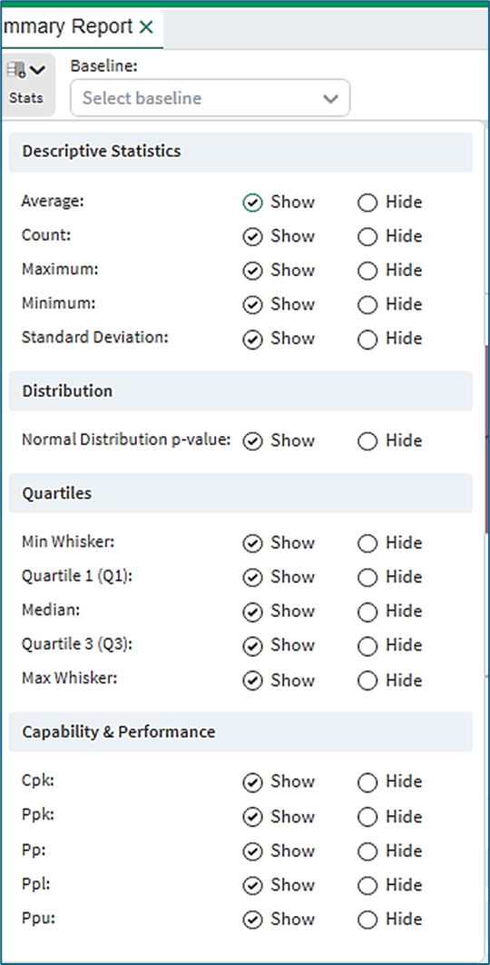
Figure 5b
Summary Report Toolbar
The toolbar at the top of the Summary Report enables customization.
Overlay: The Overlay button presents the histograms in overlaid format for detailed comparison. The box plots are presented one above another for easy comparison.
View menu (Figure 5a):
Header: The Header group allows selection of the information in the header card of Figure 4.
Visualizations: The Visualizations group allows customization of the Histogram, Box Plot and Control Charts shown in the Statistics Summary.
Stats menu (Figure 5b):
The Stats Menu allows customization of the contents of the Statistics table in the Summary Report.
Baseline field (Figure 5b):
The Baseline field is used to select a baseline Statistics Summary when comparing summaries.
Working with multiple statistics summaries
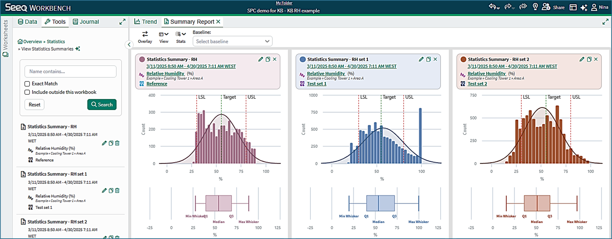
Figure 6
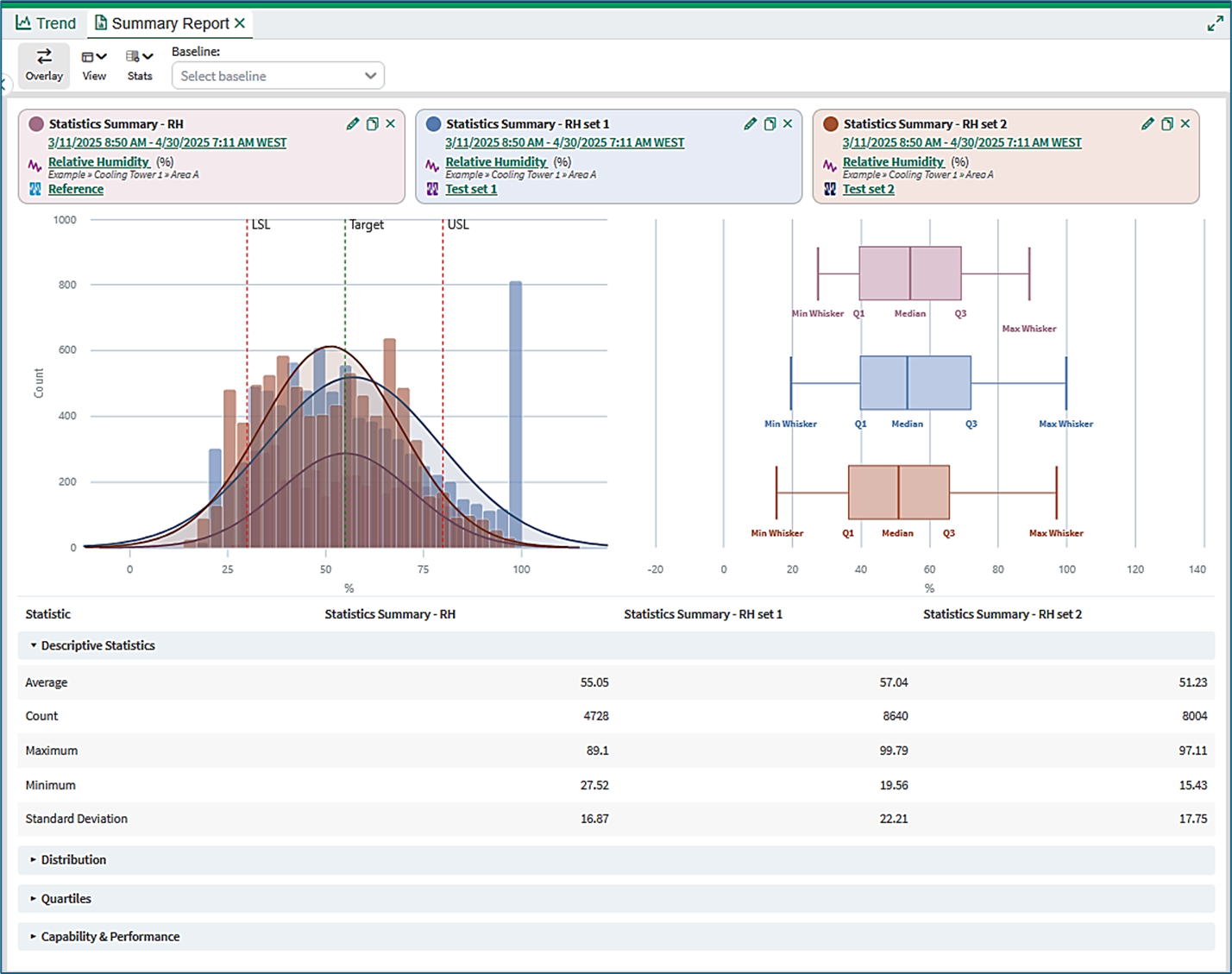
Figure 7
Side-by-side view
Selected Statistics Summaries can be viewed side-by-side, as shown in Figure 6.
Overlay view
Statistics Summaries can alternatively be overlaid to give a qualitative visual comparison (Figure 7).
Quantitative comparisons
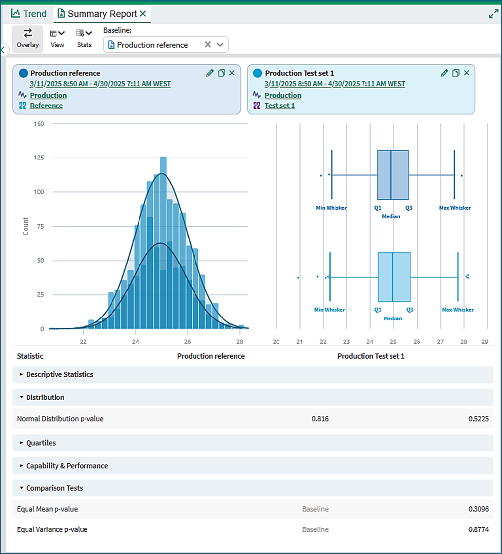
Figure 8
Selection of baseline
The baseline for comparison is selected in the Summary Report toolbar.
When a baseline is selected, an extra section called Comparison Tests becomes available in the table of statistics. It can be selected in the Stats drop-down menu in the toolbar.
Comparison tests
Normal distribution p-value: The Normal distribution test is important because the Equal Mean and Equal Variance tests are only strictly valid for Normal distributions. A Normal distribution p-value below 0.05 indicates that the distribution of values in the sample set most likely is not Normal.
Equal Mean p-value: The p-value is the probability that the means (the averages) of two Normal probability distributions are the same. A p-value smaller than 0.05 indicates that the means are most likely not the same.
Equal Variance p-value: The p-value is the probability that the variances of two Normal probability distributions are the same. A p-value smaller than 0.05 indicates that the variances are most likely not the same.
Comparable summaries
Matching units of measure: Quantitative comparison tests are only available if statistics summaries have the same units of measure.
In Figure 9, when the baseline for comparison is Statistics Summary – RH (%) the comparable statistics summaries are those in the second and third summaries. The results of comparison tests appear in the table. However, in this case the probabilities are small or zero, showing that the means and variances are not the same as in the Baseline Summary.
Non-matching units of measure: The fourth and fifth summaries cannot be compared because the units for Temperature and Wet Bulb are not the same as the units of the Relative Humidity signal.
Overlay view: When the overlay view is selected, the comparable summaries are overlaid pair-wise with the selected baseline summary, as shown in Figure 10.
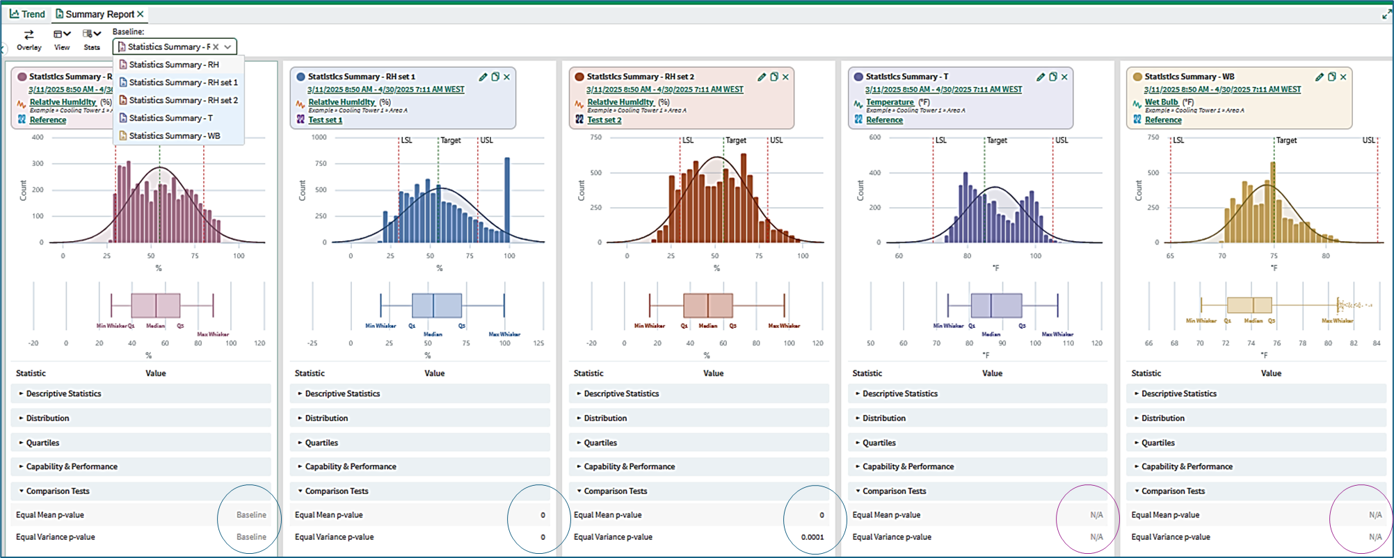
Figure 9
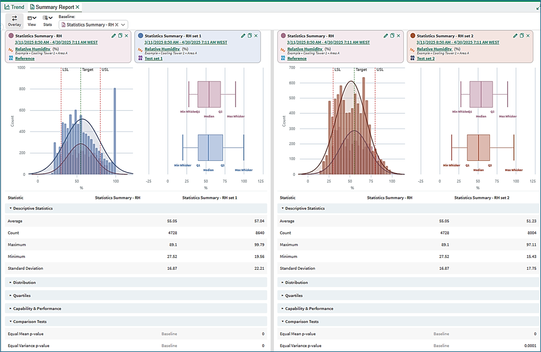
Figure 10
Information is available in the Statistics Summary KB on the topics of:
Opening and using the Statistics Summary tool
Content of a basic Statistics Summary
Content of a Statistics Summary with SPC chart
SPC Chart types
SPC Chart limits
SPC run rules
The Limit and Sample Alignment conditions
Information is available in the View Statistics Summaries KB on the topics of:
Opening and using the View Statistics Summaries tool
Information is available in the Statistics Definitions and Reference KB on the topics of:
Content of the Statistics table
Box plot calculations
Performance calculations
Probability calculations
Autocorrelation and discrete signals
Tutorial - Creating and Managing Statistics Summaries
A step-by-step tutorial is available Tutorial: Create and Manage Statistics Summaries demonstrating the use of statistics summaries for a signal in order to track the behavior of the signal over time. The signal has high sampling rate and is noisy. A derived signal is created giving daily averages of the signal. The statistical analysis is executed on a monthly basis and the results inserted into Organizer.