Statistics Summary
Statistics Summary enables users to generate a comprehensive statistical overview of a signal over a selected time window. The summary provides key insights into the behavior, distribution, and variation of the signal and the stability of the process using visualizations and statistical metrics.
The generated summary includes:
Histogram for understanding data distribution
Box plot for identifying spread, quartiles, and potential outliers
Control charts for monitoring process stability and detecting abnormal variations
Summary statistics such as mean, count, standard deviation, minimum, maximum, Cpk, and Ppk
This tool helps users quickly analyze signal quality, detect trends and anomalies, evaluate process consistency, and make data-driven decisions without requiring manual statistical analysis.
Opening the Statistics Summary tool
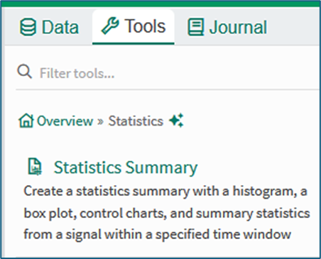
Figure 1
The Statistics Summary tool can be opened from the Statistics menu of the tools panel , or by using the search term Statistics Summary in the Tools search field. Clicking the tool opens a user interface in the tools pane.
Using the Statistics Summary tool
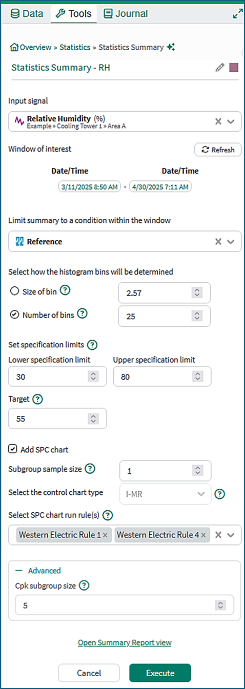
Figure 2
Title and color: The title field allows the user to select a title for the Statistics Summary. Right clicking on the colored square gives the option to select a color to be used in the summary.
Input signal: The signal to be summarized should be selected.
Window of interest: By default, the window of interest is the display range of the workbook. If the display range changes, clicking the Refresh button updates the window of interest.
For performance reasons, the signal should have no more than 150 000 samples in the window of interest. The signal should be sub-sampled or the time range of the window of interest reduced if this limit is exceeded.
Limit summary to a condition: Optionally, a condition in the window of interest can be selected. If no condition is selected then all samples within the window of interest will be included.
Histogram bins: The histogram bins to be used are specified by Size of bin (the bin width) where a recommended size is pre-filled, or by Number of bins.
Specification limits: The optional Lower specification limit (LSL), Upper specification limit (LSL) and Target fields can be set. The LSL, USL and Target, are needed for the calculation of metrics for process performance such as Ppk and Cpk.
Add SPC chart: Optionally, an SPC chart can be configured. The type of chart is stored in the Statistics Summary along with the chart control limits. The limits are calculated from the samples of the input signal using the standard SPC formulae from the Institute of Quality and Reliability.
Select SPC chart run rule(s): If Add SPC chart has been selected the run rules to be applied may be selected from the drop-down menu in the Select SPC chart run rule(s) field.
Advanced: The Cpk subgroup size field offers the option to select a subgroup size for a Cpk calculation. Cpk requires the USL and LSL to be selected.
Open Summary Report View: Clicking this link opens the Summary Report tab in the display panel of the worksheet.
Execute: Clicking the Execute button creates the Statistics Summary.
Content of a basic Statistics Summary
Figure 3a shows the output of a basic Statistics Summary in the Summary Report view for a signal that is monitoring relative humidity. The components within a basic summary are as follows:
Histogram: The Histogram shows how the sample values values are distributed across intervals.
Box Plot: The Box Plot shows the median and quartiles of the sample values, and any potential outliers.
Bell Curve: The Bell Curve shows a Normal distribution with the same mean and standard deviation as the sample set. This gives a visual indication of how similar the distribution is to a Normal distribution. The bell curve comparison in Figure 3a shows that the distribution is not Normal. This is because the relative humidity signal has daily variation superimposed on other weather-based trends.
Table: The Table lies below the Box Plot. It shows the statistics for the sample set grouped into various categories in accordion-style row groups that expand or collapse. It may be necessary to scroll to see all the values (Figure 3b).
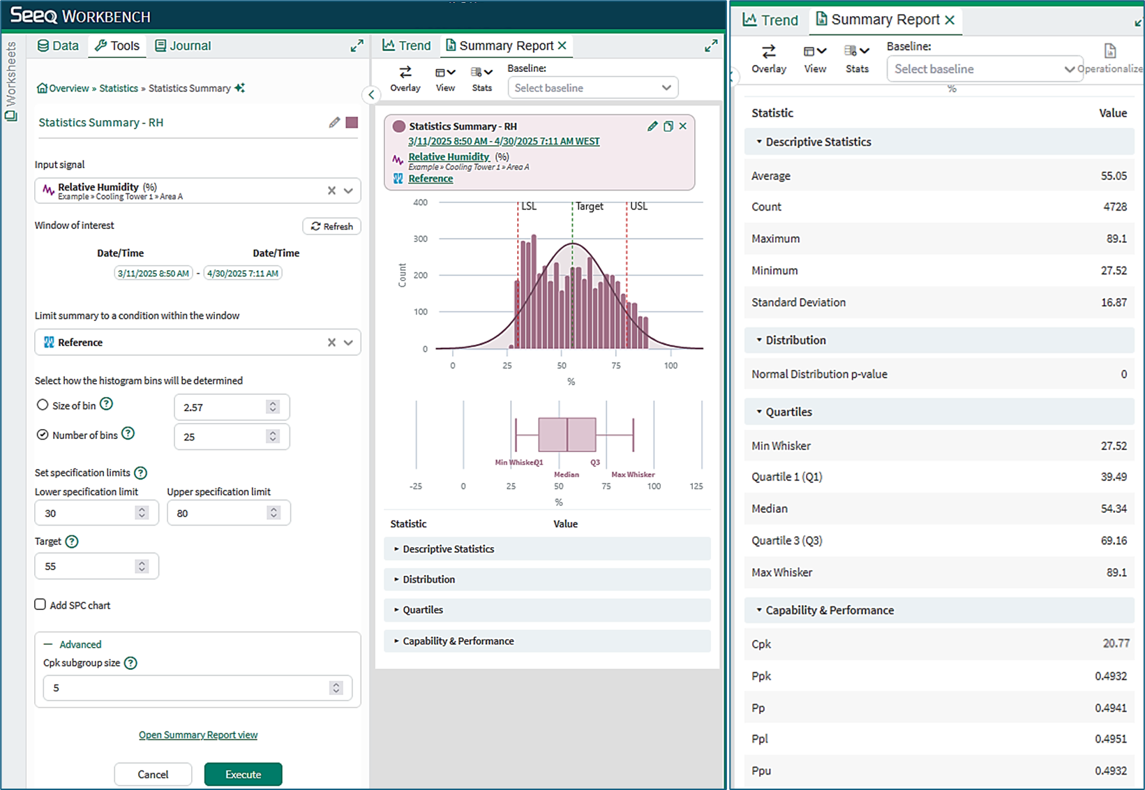
Figure 3a Figure 3b
Content of a Statistics Summary with SPC chart
Figure 4a shows an SPC chart in a Statistics Summary for a signal representing a production variable of interest (e.g. production rate). Features of interest are:
SPC chart: The added SPC chart is of type I-MR comprising a plot of the individual samples of the production measurement (I-chart) and a plot of the moving range differences between adjacent samples (MR-chart).
Chart limits: The charts show the upper and lower control limits (LCL and UCL). SPC control limits monitor the process stability, distinguishing between inherent expected process noise (common-cause variation within the limits) and non-random variation due to errors or events (assignable-cause variation).
Run rule violations: The chart in Figure 4a was configured with Western Electric Rules 1 and 4. Rule violations are indicated in the charts with colored symbols.
Outliers: The box plot shows two outliers beyond the Min and Max Whiskers. Figure 4b illustrates that clicking on the outlier opens a tool tip showing the value and timestamp of the outlier. The outlier is also identified in the charts.
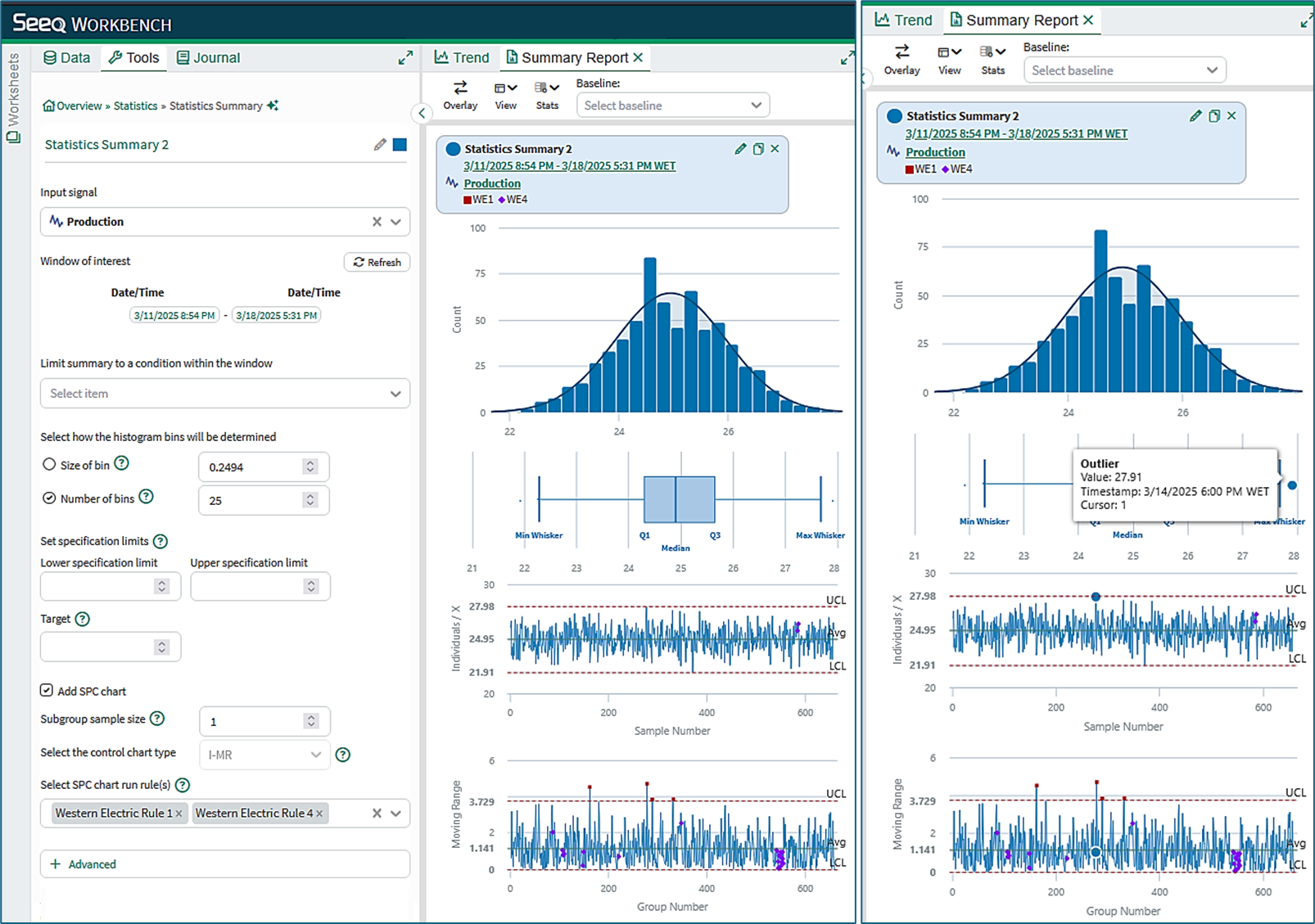
Figure 4a Figure 4b
SPC Chart types
I–MR (Individuals–Moving Range) Chart: An I-MR chart is used when data are collected as individual observations. The Individuals chart monitors the values of the measurements, while the Moving Range chart monitors short-term variation between consecutive observations.
Xbar–R (Average–Range) Chart: An Xbar–R chart is used with small subgroups of measurements. The Xbar chart monitors the process mean, while the Range chart monitors variation within each subgroup as the absolute difference between the maximum and minimum values.
Xbar–S (Average–Standard Deviation) Chart: An Xbar–S chart is used with larger subgroups. The Xbar chart monitors the process mean, while the Standard Deviation chart monitors variation within each subgroup using the subgroup standard deviation.
SPC Chart limits
Chart limits define the expected range of natural process variation. They are calculated from a reference dataset and are displayed as a center line together with upper and lower control limits. Individuals and Xbar- charts optionally may also use one- and two-sigma limits. Measurements falling outside these limits may indicate a special-cause variation requiring investigation.
The calculations behind chart limits are given here.
SPC run rules
Run rules are pattern-detection rules applied to control charts to identify non-random process behavior. The Western Electric rules WE1–WE4 detect points beyond control limits, sustained shifts from the center line, and other patterns that may indicate a process change.
For additional information on the Western Electric run rules (WE1–WE4), see the Wikipedia article on Western Electric rules.
The Limit and Sample Alignment conditions
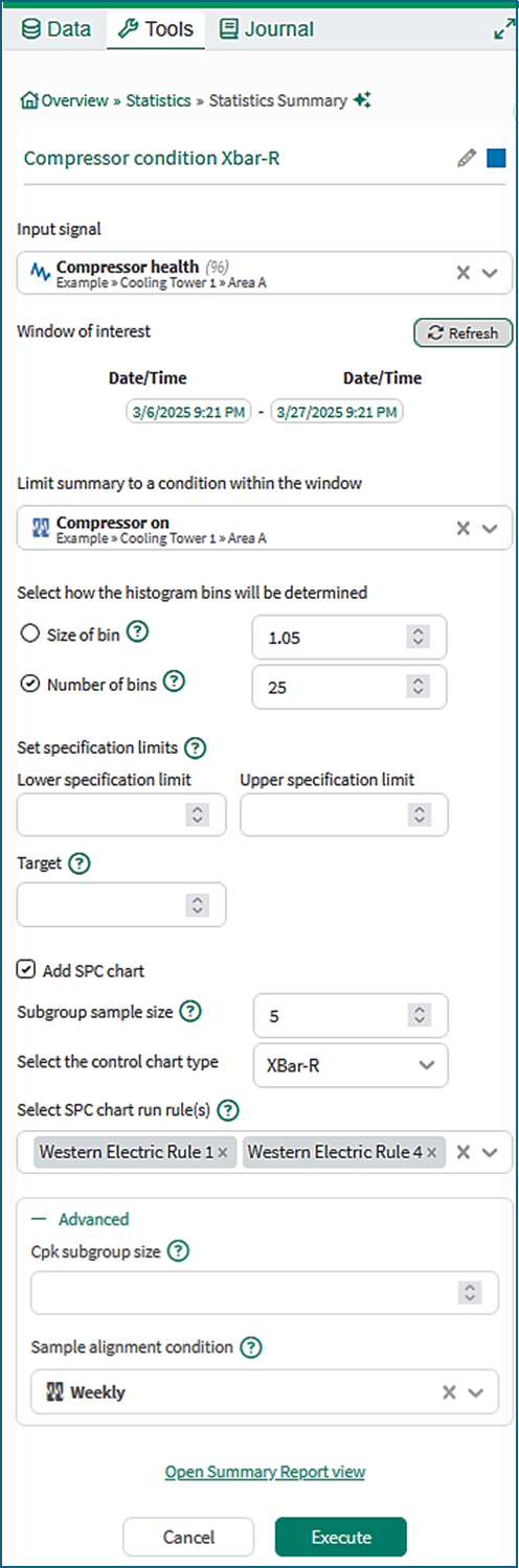
Figure 5
Limit summary to a condition
The optional Limit condition restricts SPC calculations to measurements collected under specified operating conditions, for instance when a machine is running. Measurements outside the capsules of the limiting condition are ignored. When valid measurements resume, subgroup formation and run-rule evaluation continue using the next valid samples unless a group alignment boundary has been reached.
Sample alignment Condition
The Sample alignment condition defines how subgroup boundaries are determined for Xbar–R and Xbar–S charts. Subgroups must be aligned to operational periods such as shifts, days, batches, or production grades. When a new alignment period begins, a new subgroup is started and the run rules are reset.
If the alignment condition has breaks between its capsules, then the samples in those breaks are not used.
The Alignment condition can be manually configured in the Advanced section of a Statistics Summary. In Figure 5, the user has chosen “Weekly”. Sample alignment defaults to the Limit condition if one is selected, otherwise it defaults to “Weekly”.
Example
Figure 6 shows the Statistics Summary for a Compressor Health signal that is monitored on a weekly basis when the compressor is on. The Limit condition is ‘Compressor on’, and the Signal Alignment condition is “Weekly”.
The highlights in the Xbar-R chart show the resets at the start of each new “Weekly” capsule.
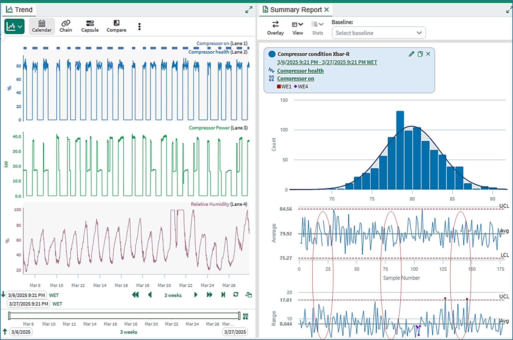
Figure 6
Further information
Information is available in the Summary Report KB on the topics of:
Tabbed viewing
Summary Report controls and configuration
Working with multiple statistics summaries
Quantitative comparisons
Information is available in the View Statistics Summaries KB on the topics of:
Opening and using the View Statistics Summaries tool
Information is available in the Statistics Definitions and Reference KB on the topics of:
Content of the Statistics table
Box plot calculations
Performance calculations
Probability calculations
Autocorrelation and discrete signals
Tutorial - Create and Manage Statistics Summaries
A step-by-step tutorial is available here Tutorial: Create and Manage Statistics Summaries. The tutorial walks through the complete Statistics Summary workflow, including preparing input data, creating statistics summaries, inserting summaries into an Organizer topic, updating reports, and tests for equal means and variances.