XY Plot
Basics
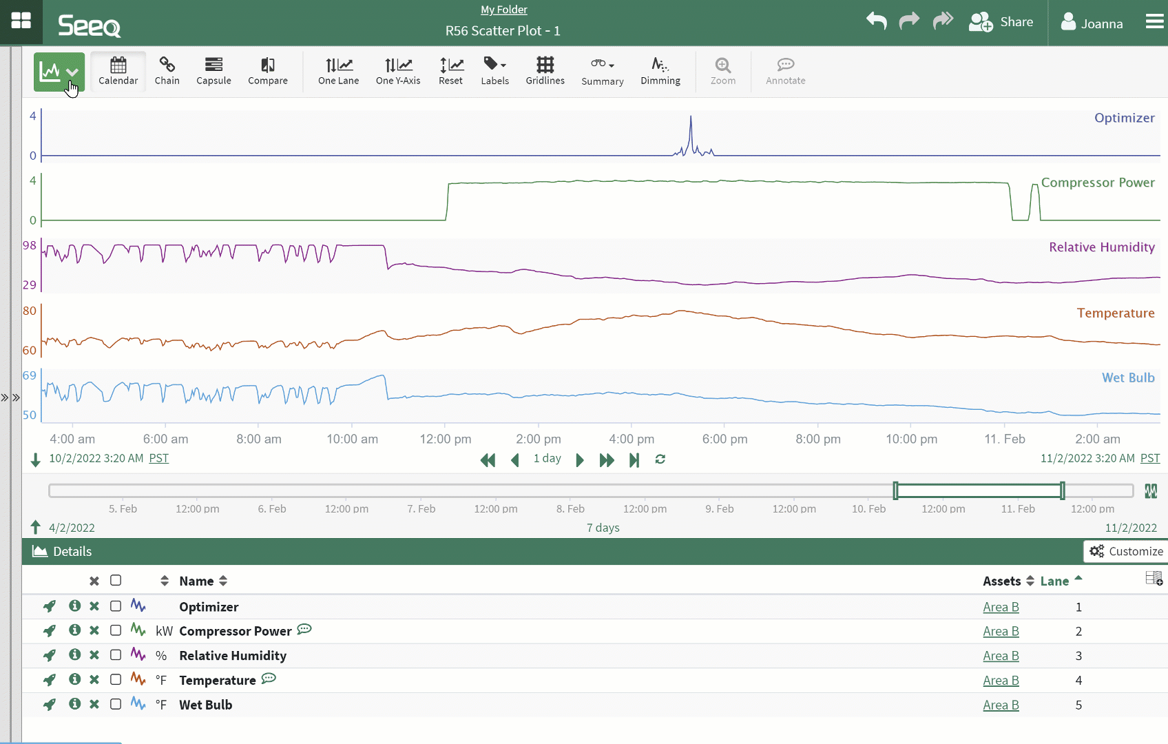
XY Plot with Scatter and Density Plotoptions helps users visualize relationships between signals outside of the time domain. To enter into XY Plot, click the mode button 
Selecting Signals
Any signal present in the Details Pane may be selected as either the x- or y-axis signal. The swap button will change the x- and y-axis selections. Signals can be assigned to an axis in either the toolbar or the Details Pane.
More than one signal can be configured to display as a y-axis. Presently each additional y-axis signal will come with its own axis.
Entering XY Plot and Selecting Signals
Zooming In
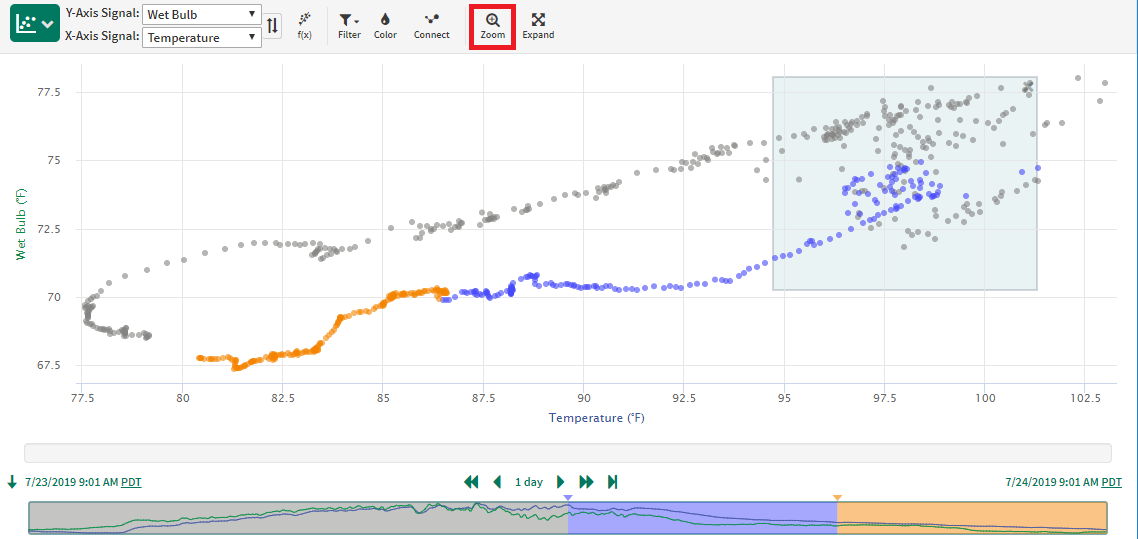
Zooming and Navigating
Select anywhere on the XY Plot and click the Zoom button to zoom in to that area.
The data is resampled following this zoom to maximize the data displayed. Click Expand to return the x- and y-axis ranges to encompass all the data in the display range.
Navigating the x- and y-axes is the same as Trend View:
Hover over the axis, then click and drag to shift the x- or y-axis in that direction.
Hover over the axis and use the mouse scroll to zoom in and out.
The x and y axis range can also be configured in the Details Pane when auto min/max is disabled. The Expand button will be the same as reselecting Auto in the Details Pane.
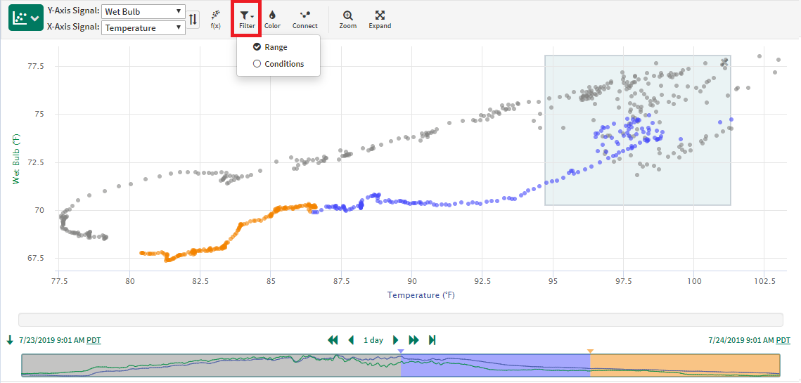
Filtering Data in a XY Plot
Data in a XY Plot can either be filtered to the entire display range or to one or more conditions within the display range.
To enter into the condition filter mode, click the 
When filtering by Conditions, the conditions selected will also display as colored regions of the minimap.
Filtering Data by Condition
Coloring the Data
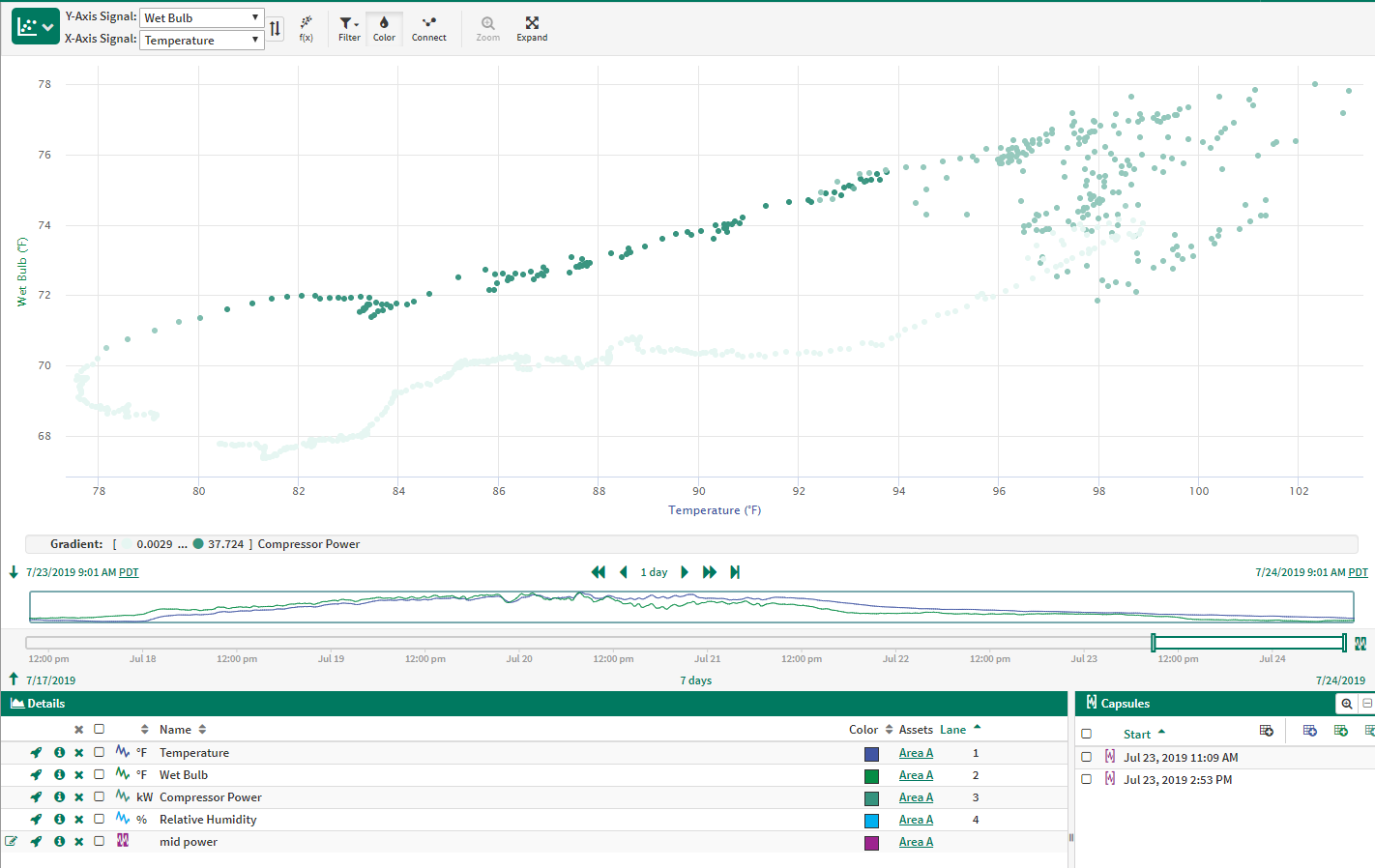
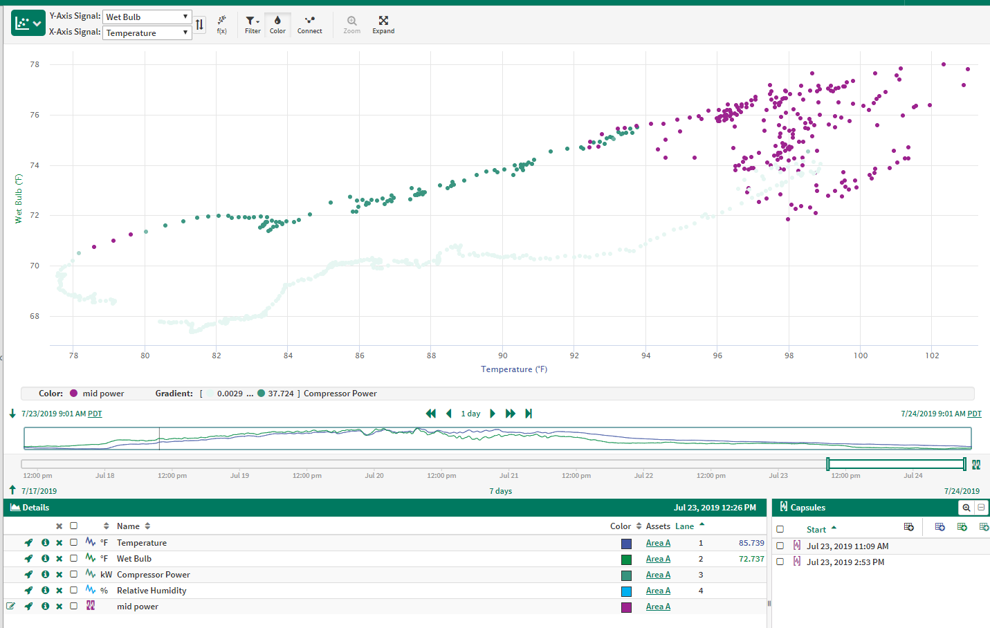
Data can be colored by time, by the values of a signal, or by condition. Condition coloring can be present with both time and signal, but time and signal are exclusive of each other. The priority of the different coloring options is: capsule selection, capsule property, condition, custom date ranges, signal, relative time. A particular point on the XY Plot will be colored by the first one of these options which applies to the point.
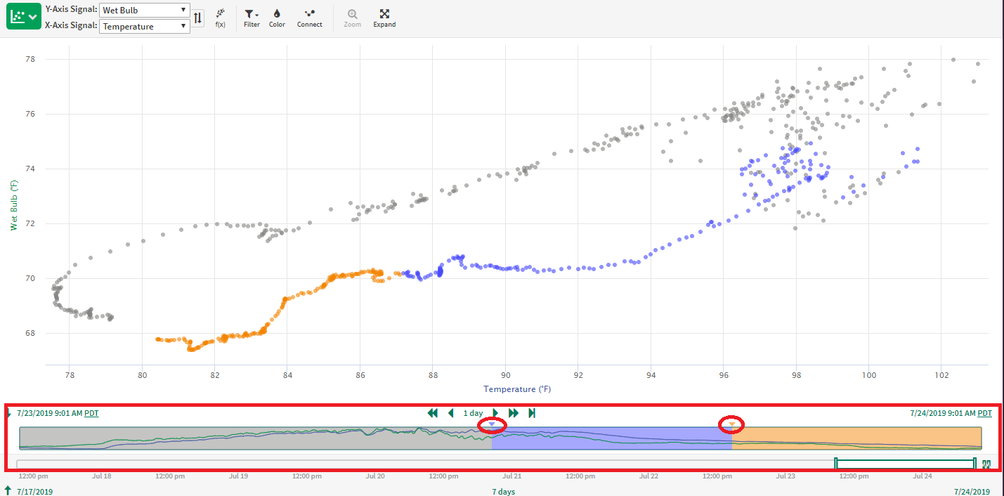
Color by relative time
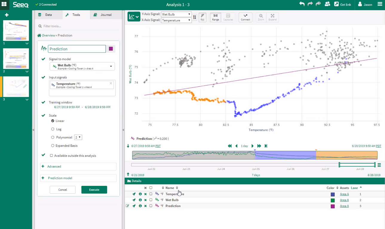
Coloring by relative time is the default when navigating to the XY Plot. The minimap below the XY Plot shows a simple trend of the two signals which are currently being plotted. Three colors can be used to show how the relationship between your signals is changing over time. The oldest data is grey (default 50% of display pane), followed by blue in the middle and the most recent 25% of data is shown in orange. To change the time range represented in each color bucket, drag the arrow between the colors as shown in the screenshot to the right.
Eliminating color by relative time
To remove the blue and orange colors drag the border between blue and grey all the way to the right side of the minimap. To get the color buckets to reappear, click and drag the triangle back to the relative location desired. Alternatively, turn on coloring by a third series or fixed date ranges to eliminate coloring by relative time..
Coloring by Relative Time
Color by Condition
Color by Condition R21.0.44.00 and later
Color by Condition
Select conditions used for coloring from the 
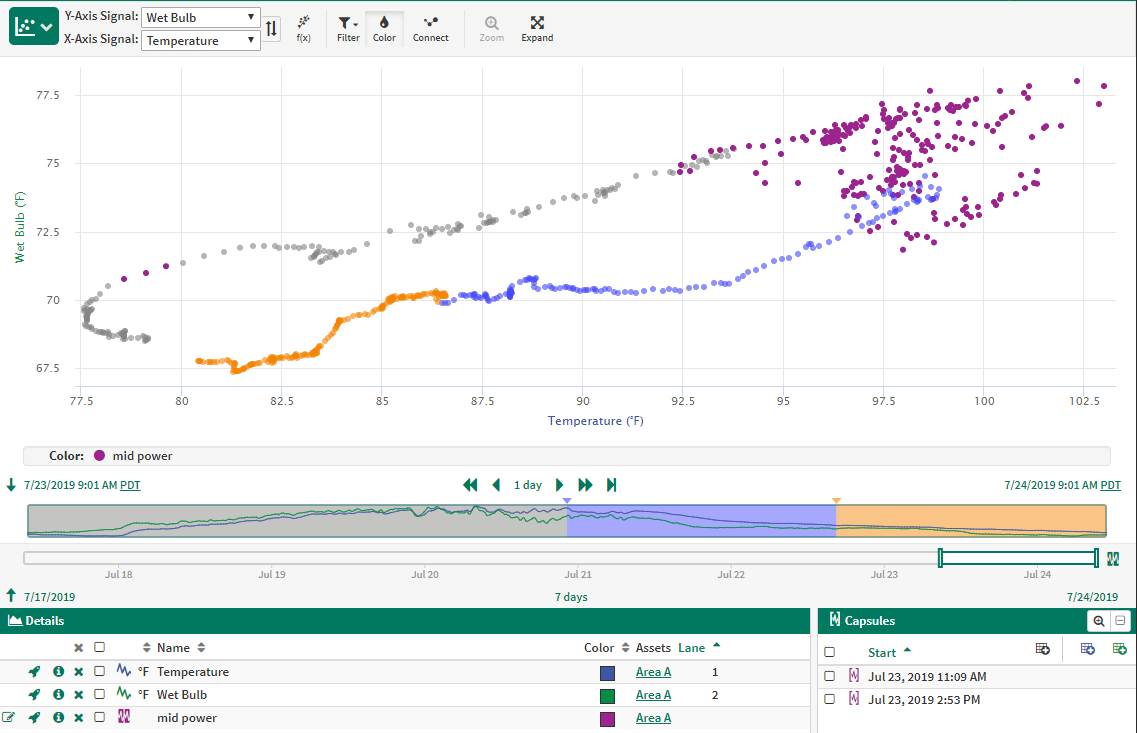
Color by Capsule Selection
To color individual points that fall within a specific capsule, select the check box next to the capsule in the Capsules Pane. Then, points that don't fall within a selected capsule will appear faded on the plot.
The color of the points will either match the color of the condition or (if present) the color corresponding to a capsule property value. If you would like to change the color of the points, simply change the condition color by choosing a new color in the Color box associated with that item in the Details Pane.
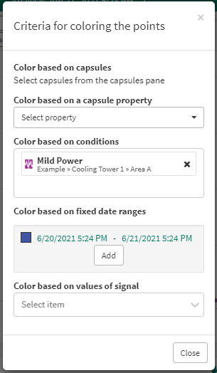
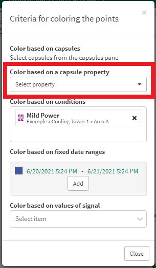
Color by Capsule Property
Select a capsule property for coloring by clicking on the
Points can be colored based on the values of a capsule property on any condition in the Details Pane. String-valued properties, as well as a capsule's start and end times, will be colored in rainbow colors. Numeric properties will be colored with a gradient similar to coloring by signal; the base color for this gradient can be changed in the color pop up. If a point on the plot is not within a capsule that has the selected capsule property, then it will be colored by a lower-priority coloring option (e.g. condition, signal, color range, relative time). If any conditions are selected in the Details Pane, then values of the capsule property for these conditions will be used for coloring the XY Plot points. If a point falls within multiple capsules, then the value used for coloring the point will be the capsule property value from the capsule with the earliest start time that has a valid value for the capsule property.
If you are coloring the points with a capsule property and you select a capsule in the Details Pane, the points within that capsule will appear in the capsule property color (for a string-value property) or the base color of the gradient (for a numeric property). Points not within selected capsules will fade so that the points within the selected capsules stand out.
Color by Capsule Property
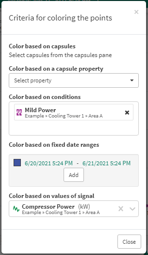
Color by values of a signal
A third signal can be used to color the points of the XY Plot. Click the
Color by values of a signal
Color by values of a signal and a condition (pop up)
Color by values of a signal and a condition (result)
Color by fixed date ranges (pop up)
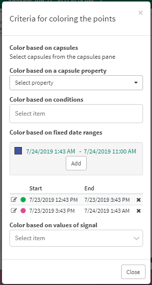
Color by fixed date ranges
Points can also be colored by fixed date ranges instead of relative date ranges. Identify fixed date ranges used for coloring from the
Edit the date range or color selected by clicking the Edit icon, or remove the date range to remove the associated coloration. The start and end dates will be displayed in the legend if within the display range.
Color by fixed date ranges (result)
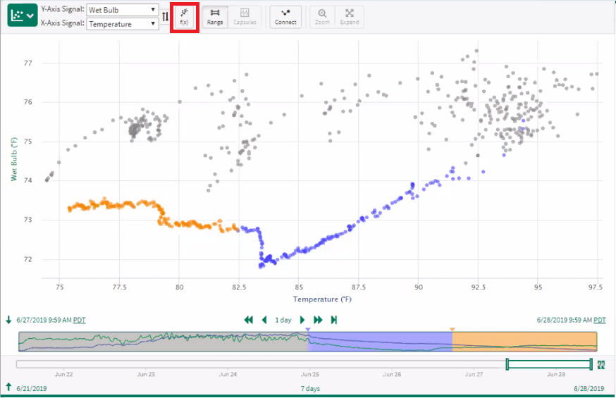
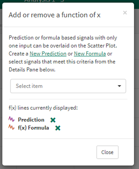
Adding Trend Lines
Lines that are functions of a single variable can be added to the XY Plot. This applies to single input Predictions and to Formulas with one signal input and any number of scalar inputs. To add or remove a line, select the 
Line colors may be changed after the trend line is displayed by choosing a new color in the color box associated with that item in the Details Pane. The thickness of the lines drawn can be updated in the Details Pane.
Add a function of x | Pop up to select or remove |
 |  |
Single Input Prediction
Any new single input Prediction created based on the x- and y-axis signals will automatically display after executed. The name and the r squared value are automatically displayed.
When displaying a Prediction that is not associated with x- or y-axis variables, a yellow triangle is displayed in the Details Pane indicating that it may not be relevant to display. Similarly, a yellow triangle will be present in the Details Pane associated with this item if the training window of the Prediction is entirely outside the display range.
Single Input Prediction
Single Variable Formula
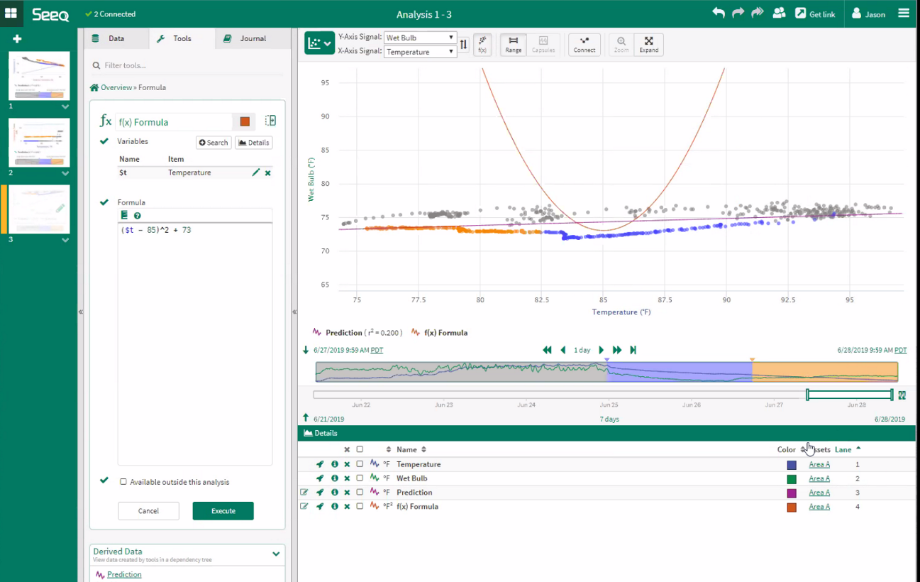
Single Variable Formula
Display any function of x through Formula. When opening Formula from the Add or remove a function of x pop up, the x-axis variable is automatically assigned to the variable $x. Variable name is not required to be $x nor is it required to be associated with the x-axis in the XY Plot.
When displaying a function that is based on some variable other than the x-axis, a yellow triangle is displayed in the Details Pane indicating it may not be relevant to the display.
Scalars can also be included as constant inputs into this single variable formula
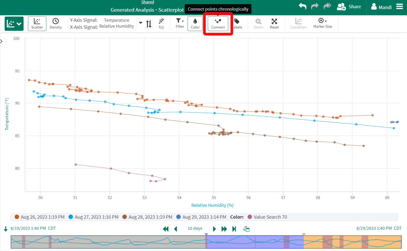
Connecting points chronologically
Click the “Connect” button to show/hide a thin line that connects points in chronological order.
This is useful for distinguishing groups of points, especially when points are tightly clustered on the graph.
Connecting points chronologically