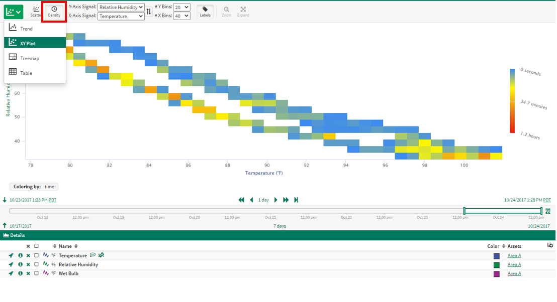
Density Plot
Basics
Density Plot mode helps users visualize relationships between signals outside of the time domain, with an emphasis on common behavior. To enter into the Density Plot, click the mode button 

Selecting signals
Any signal present in the Details Pane may be selected as either the x- or y-axis signal. The swap button will change the x- and y-axis selections.
Selecting the number of bins
The quantity of x- and y-bins can be changed via dropdowns. The available values are multiples of five between five and 100.
Entering Density Plot
Zooming In
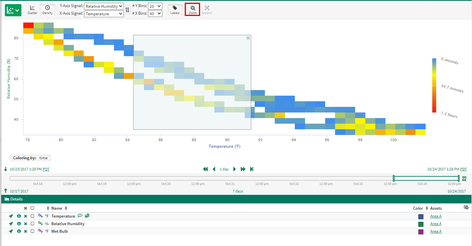
Zooming and navigating
Select anywhere on the Density Plot and click the Zoom button to zoom in to that area
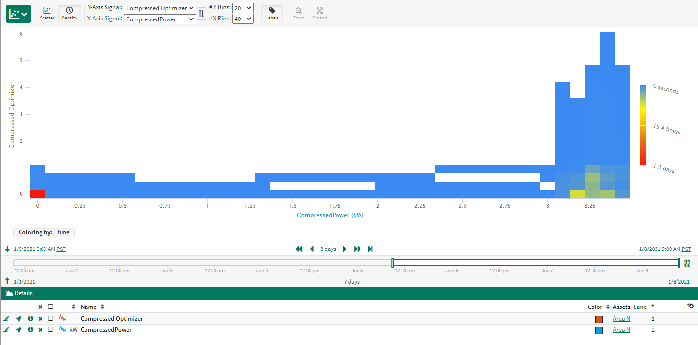
Compressed Data
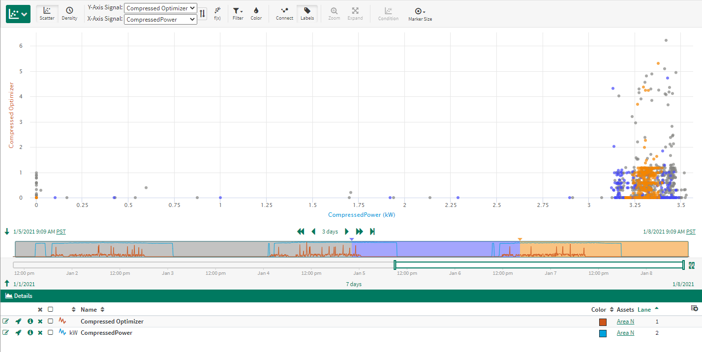
Density Plot can be a helpful visualization when comparing two signals that have been compressed during data collection. Some data is collected in periodic increments, like every 60 seconds. Other data has compression applied when recorded by the historian, where new data points exist when the value has been determined to have changed by a configured amount.
Scatter Plot view represents pairs of signal values when either signal has a data point recorded. But in the case of compressed data, the same signal value may occur for an extended amount of time and will not be represented by repeated values in Trend View.
See the example to the right where both Optimizer and Compressor Power signals have been compressed such that when there is no significant change the data is not recorded on a periodic fashion. When viewed in the Scatter Plot, the data appears concentrated where Compressor Power is higher. But if we look at that same data over time in the Density Plot, the majority of the data is concentrated in the "OFF" position where there is no Optimizer and No Power, as shown by the red coloring of the lower left cell.
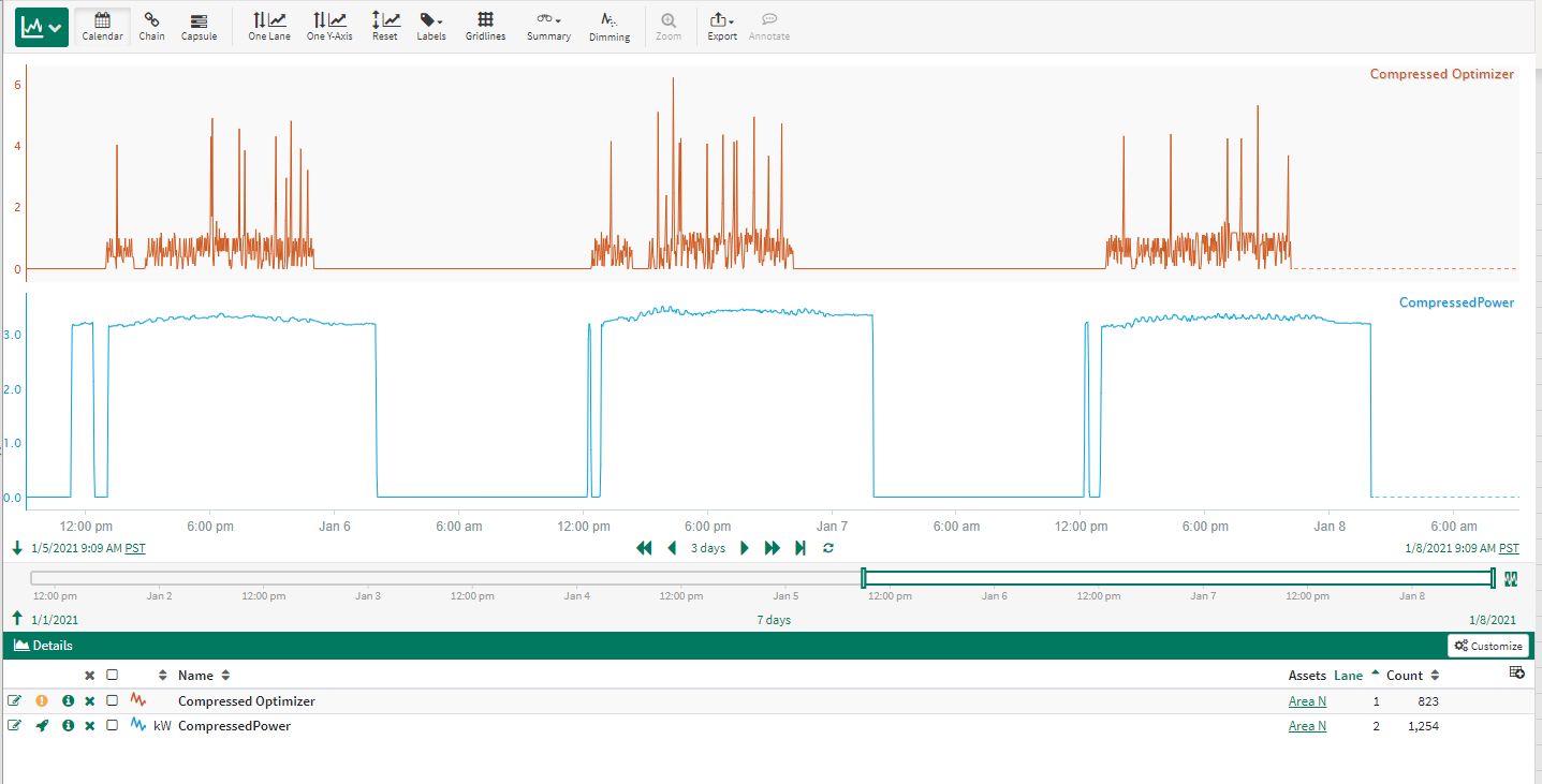
Compressed Signals in Trend View
Compressed Signals in Scatter Plot
Compressed Signals in Density Plot