Signal Summarization
Seeq trends represent historian data in its fullest integrity, displaying peaks and valleys, where present, when looking at a very large data set. Seeq’s display algorithm intentionally displays the minimum and maximum values when there are not enough pixels to draw the detail. Many users take advantage of Data Cleansing in Seeq to curate cleansed process signals to represent how they and others viewing their dashboards may want to consume the data. For users looking to visually down sample data displayed, summarization with Fixed Average will suffice. Automatic summarization is also available to enable more user input into the display algorithm. Note that summarization is a visual tool for displaying all numeric signals on a single display. Any capsules in the display will be based on the unsummarized signal values. Users can continue to use Seeq Tools to cleanse data in lieu of summarizing a display when they wish to control capsules created.
Applying Summarization
Access Signal Summarization from the Toolbar.
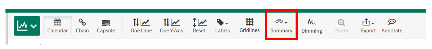
Select Automatic or Fixed Average.
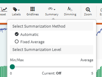
Use Automatic to automatically update the level of detail shown in the trends, based on the amount of data to display. With this option, you probably will not need to change the level of summarization when you zoom in or out.
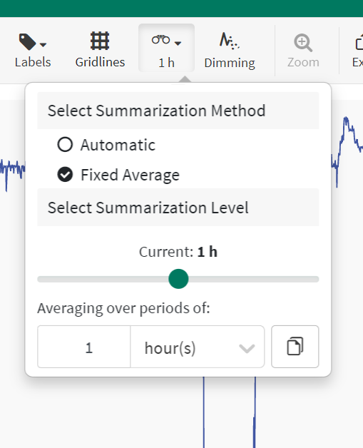
Use Fixed Average to use a user-selected average to reduce the level of detail shown in the trends. The average period selected will apply regardless of the date range displayed, so you may need to change this level of summarization when zooming in or out on the trend. Drag the slider or enter a specified period in the area below the slider.
How do you know summarization is enabled?
Summarization will be noted in Workbench with a depressed button and text below indicating the type and level of summarization, Shown here: Level 2 of Automatic Summarization.

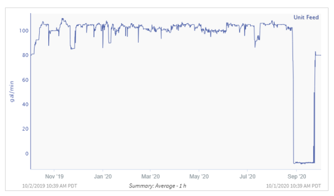
In Topics, each image will note the level of summarization between the dates displayed when applied. Shown here: Fixed Average with 1 hour period.
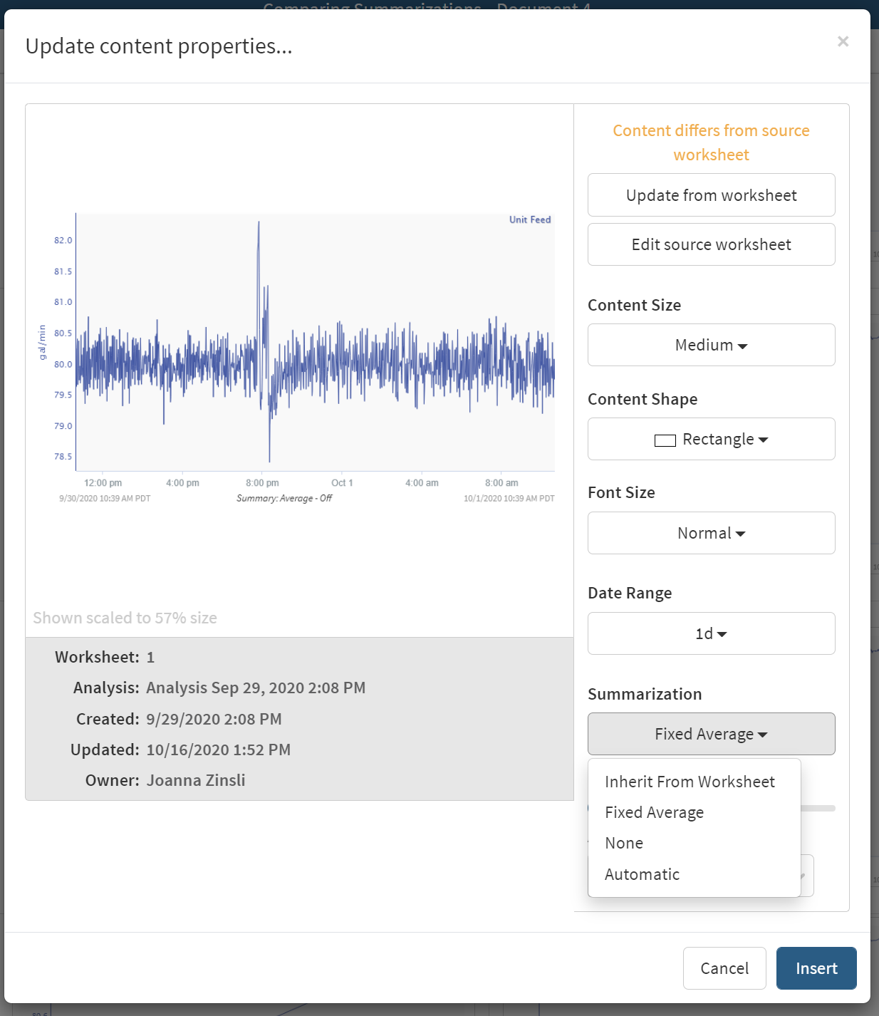
Applying Summarization in Topics
Summarization can also be set in an Organizer Topic. Both the Update Content and Bulk Update modals use the same interface to allow users to select the summarization technique to display in a Topic.
Automatic Summarization
When plotting and analyzing data, there is a limited amount of space for potentially massive data sets to be plotted on. The space available is the width of the graph in pixels, so if a user has a 1080p screen, but wishes to plot a million data points, all they will see, if all the samples get plotted, is a solid blob, with no discernible features.
As an example, consider the graphic below.
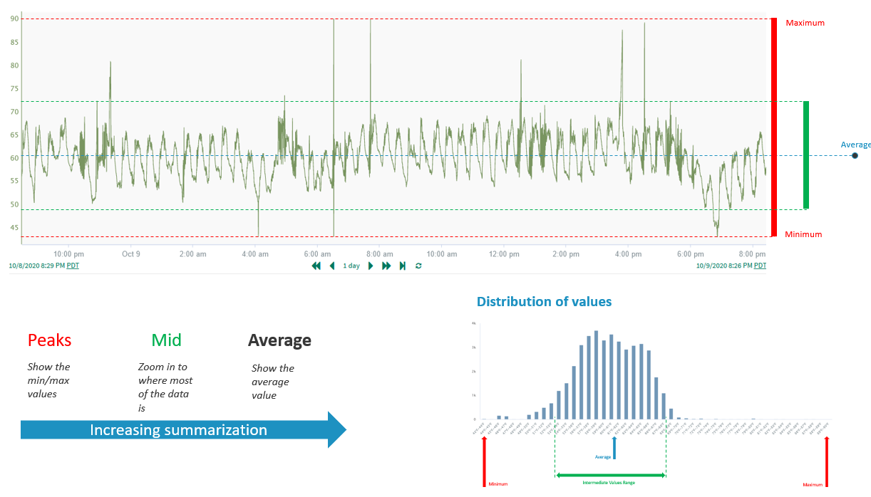
We are looking at at a day's worth of data, but imagine if we zoomed our viewing interval out so far that this one day had to be represented in a single line of pixels on your screen. (Or, conversely, imagine this day’s worth of data is a few minutes worth, so the scale to which you would zoom is easier to imagine).
How should this data be represented in order to maintain fidelity? There are two extreme ends of the answer:
Emphasize only the extrema (min, max, and invalid data)
More ‘noise’, retains full peaks and valleys and calls attention to gaps
Take the mean of the data and output that value
Least amount of ‘noise’, reduces peaks and valleys to allow other features to emerge.
At Seeq, we use a proprietary algorithm to allow the user to scale between these two extremes, making sure each possible equivalence class of down-sampled data is available to view for the user. On the left of the slider in the UI, you have standard Seeq down sampling, an algorithm called spikeCatcher, which you can read about at the bottom of this post, “When Clean Data Is Too Clean.” Once you slide to the right, you will be using a modified version of this algorithm that will scale from emphasizing the min/max to emphasizing the average in each column of pixels.
Comparing Automatic and Fixed Average Options
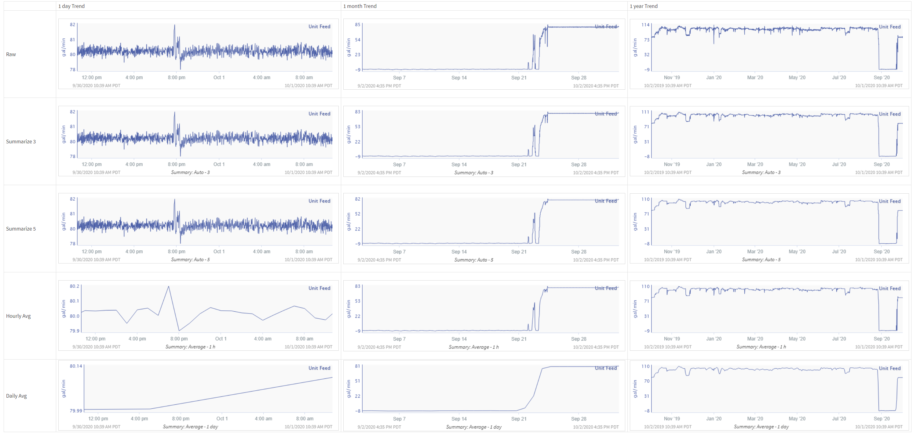
The table below compares the same minute sampled data with a variety of summarizations applied. Hourly and daily averages can remove more detail than desired when viewing short ranges of data (1 day to 1 month). Automatic maintains the detail when all points can be represented and will not display short deviations from average data with longer ranges of data.
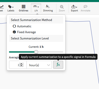
Fixed Average as Persistent Formula
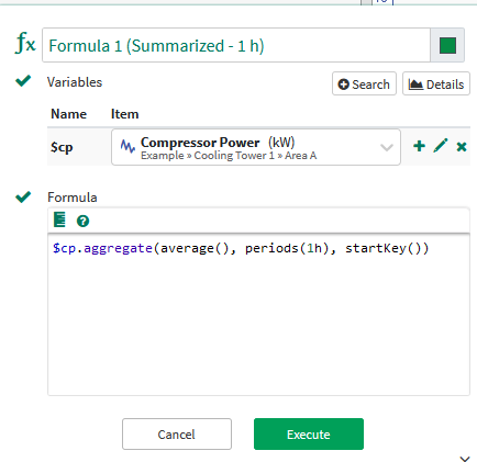
When using the fixed average method, you may want to keep the summarized version of a signal. This can be accomplished by using the Formula button in the summary drop-down:
Using the Formula button shown in the figure to the left, automatically open the Formula tool pane with the currently in use summarization Formula fragment.
The Formula pane will pop up, with most of the desired Formula in place. Click the plus icon next to the signal you wish to use.
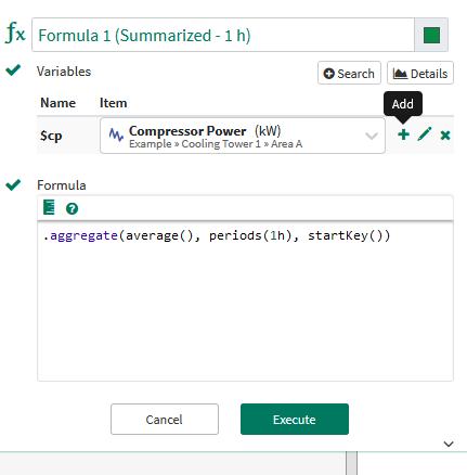
3. Now the Formula is ready to run, click Execute to complete.
Note: Feel free to rename the Formula to better represent your data.