Applies To: Python Plotter Add-on ≥ v1.0.0
Overview
The Python Plotter Add-on enables users to create rich, custom visualizations directly within Seeq Data Lab and visualized in Workbench. It uses the signals and conditions in the Details Pane and the display range in the Display Pane to dynamically call a POST /plot endpoint inside a Seeq Data Lab project.
Plots can now return results to multiple supported renderers, including Plotly, Highcharts, Bokeh, or direct HTML/SVG, allowing authors to use their preferred visualization libraries while maintaining a consistent experience in Workbench.
Key Features
-
Dynamic Figure Generation: Create plots using the
POST /plotendpoint that automatically updates when the Details Pane or display range changes. -
Multi-Renderer Support: Return results via a structured JSON envelope (
chartType:plotly,highcharts,bokeh) or as direct HTML/SVG. -
Flexible Plotting Libraries: Supports Plotly, Highcharts, Bokeh, and Matplotlib-to-SVG rendering.
-
Custom HTML Support: Any valid HTML or SVG string returned from
/plotwill render directly in Workbench. -
Simple Export Options: Visualizations can be saved as images or embedded using browser tools.
Usage
-
Open the Python Plotter Add-on in Workbench.
-
Select a Plot Type from the dropdown menu.
-
If the selected plot exposes options, open the gear control to change them (for example aggregation, legend, bins). Use Restore defaults to reset.
-
The Add-on executes the project’s
POST /plotendpoint and displays the visualization.
The Add-on sends a JSON request body to the endpoint that includes context from the display pane:
{
  "start": 1695898858683,
  "end": 1698308230500,
  "signals": [{}],
  "scalars": [{}],
  "conditions": [{}],
  "metrics": [{}],
  "height": 347,
  "width": 1185,
  "config": {}
}
config holds author-defined plot options from GET /configuration (empty object when the plot has none).
Reactive Changes
The /plot endpoint automatically re-executes whenever:
-
The display range changes (start or end).
-
Items in the Details Pane change (signals, conditions, metrics, scalars).
-
The plot dimensions change (height or width).
-
Plot configuration options change (values under
config).
This ensures the visualization always stays synchronized with user context.
Plot configuration options
Plots can expose optional UI controls through a GET /configuration endpoint in the plot’s API.ipynb. When present, the Add-on shows a gear control in Workbench. Values are sent on every POST /plot under config and are saved with the workstep.
For users
-
Open the gear to edit options for the selected plot.
-
Number fields show min/max hints and clamp to that range.
-
Restore defaults resets all options for the current plot schema.
For plot authors
Add a notebook cell:
# GET /configuration
{
    "options": [
        {
            "key": "aggregation",
            "label": "Aggregation",
            "type": "select",
            "default": "D",
            "choices": [
                {"label": "1 day", "value": "D"},
                {"label": "1 hour", "value": "1h"},
            ],
        },
        {
            "key": "showLegend",
            "label": "Show legend",
            "type": "boolean",
            "default": True,
        },
        {
            "key": "bins",
            "label": "Bins",
            "type": "number",
            "default": 30,
            "min": 5,
            "max": 100,
            "step": 1,
        },
    ],
}
Supported option types: select, boolean, number.
|
Field |
Required |
Description |
|---|---|---|
|
|
yes |
Stable id stored in |
|
|
yes |
UI label |
|
|
yes |
|
|
|
recommended |
Initial value and restore target |
|
|
for |
|
|
|
for |
Range and step; UI clamps to min/max |
In POST /plot, read options with:
config = REQUEST["body"].get("config") or {}
If GET /configuration is missing or returns no options, no gear is shown.
Built-in examples
Candlestick: aggregation window, show legend, separate lanes.
Violin: bins, show legend, violin width, show box/quartiles, show mean, tooltip decimals.
Authors can also ship a README.md in the plot project; when present it appears in the Help modal README tab.
Response Formats
The Python Plotter Add-on supports two types of responses:
1. JSON Envelope (Recommended)
Return a structured JSON object that instructs the front-end which renderer to use.
{
  "chartType": "plotly",
  "spec": {}
}
Required Fields
|
Field |
Type |
Description |
|---|---|---|
|
|
string |
Renderer identifier ( |
|
|
object |
Renderer-specific specification ( |
Optional Fields
|
Field |
Type |
Description |
|---|---|---|
|
|
object |
Renderer-specific configuration. |
|
|
number |
Desired pixel dimensions (defaults to 100%). |
2. Direct HTML/SVG (Legacy Compatible)
Return a valid HTML or SVG string directly (no envelope).
This method is ideal for simple static plots or when exporting an image from Plotly or Matplotlib.
Registering a New Plot
To add new plot types to the dropdown, create a Data Lab project with the following structure:
|
Requirement |
Description |
|---|---|
|
Project Name |
Must include |
|
Notebook Name |
Must include a notebook named |
|
Endpoint |
The notebook must have a cell that defines a |
|
Configuration |
Optional |
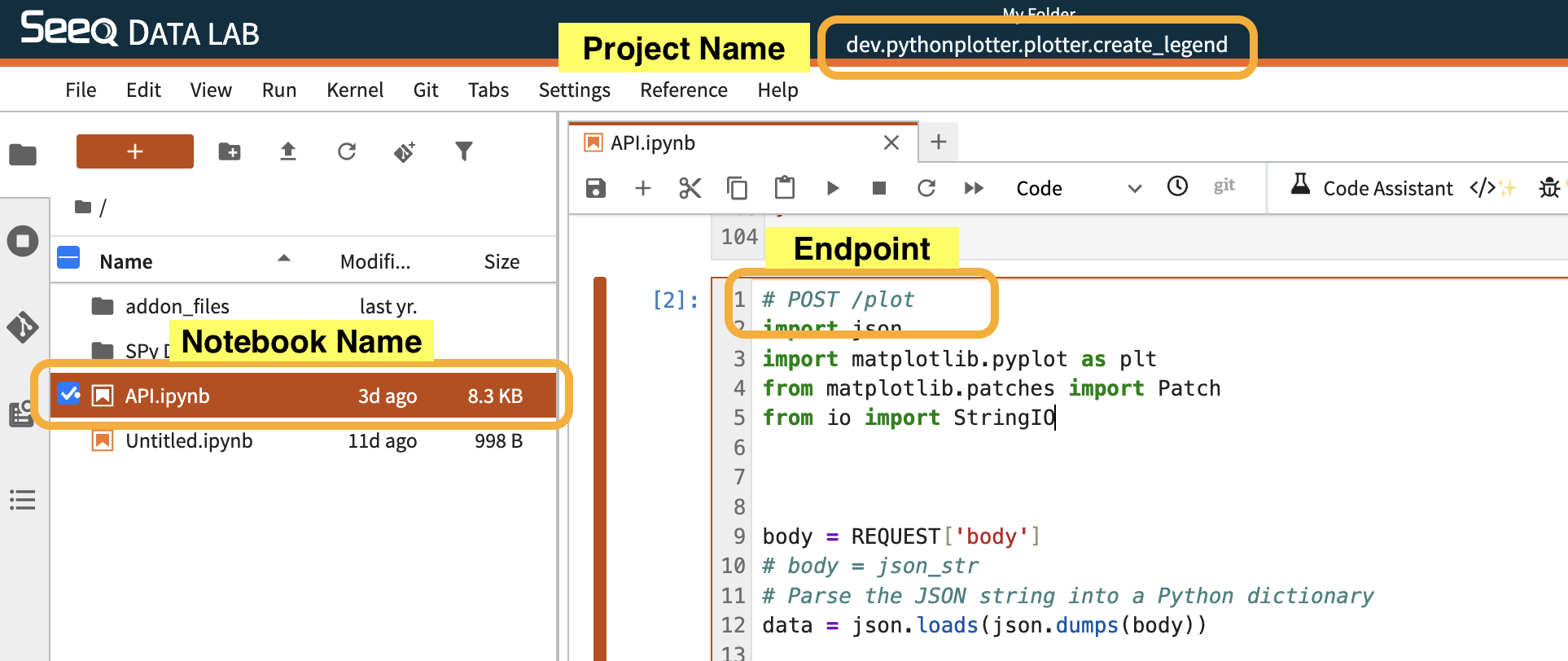
Example Plot Name:
pythonplotter.plotter.cool_new_plot
→ Appears as “Cool New Plot” in the dropdown.
Example Implementations
1. Plotly Violin
Renders a violin per signal using Plotly’s Violin trace. Series are converted to JSON-safe lists. Optional GET /configuration drives box/mean overlays and legend. Returns an envelope with chartType: "plotly" and spec: fig.to_plotly_json().
# GET /configuration
{
    "options": [
        {"key": "showLegend", "label": "Show legend", "type": "boolean", "default": True},
        {"key": "showBox", "label": "Show box / quartiles", "type": "boolean", "default": True},
        {"key": "showMean", "label": "Show mean", "type": "boolean", "default": True},
    ],
}
# POST /plot
import pandas as pd
import plotly.graph_objects as go
from seeq import spy

body = REQUEST['body']
config = body.get('config') or {}
show_legend = bool(config.get('showLegend', True))
show_box = bool(config.get('showBox', True))
show_mean = bool(config.get('showMean', True))

signals = pd.DataFrame(body['signals']).rename(columns={'id': 'ID'})
start = pd.to_datetime(body['start'], unit='ms')
end = pd.to_datetime(body['end'], unit='ms')

search = spy.search(signals, all_properties=True, quiet=True)
pull = spy.pull(search, start=start, end=end, grid=None, header='ID', quiet=True)

fig = go.Figure()

for sig_id in search['ID']:
    _name = signals.loc[signals['ID'] == sig_id, 'name'].iloc[0] if 'name' in signals.columns else str(sig_id)
    _color = None
    if 'color' in signals.columns:
        _color = signals.loc[signals['ID'] == sig_id, 'color'].iloc[0]
        _color = str(_color) if _color is not None else None

    series = pull[sig_id]
    y_vals = series.astype(object).where(series.notna(), None).tolist()
    x_vals = [_name] * len(y_vals)

    fig.add_trace(go.Violin(
        x=x_vals,
        y=y_vals,
        name=_name,
        line_color=_color,
        box_visible=show_box,
        meanline_visible=show_mean,
        opacity=0.6
    ))

fig.update_layout(xaxis_showticklabels=True, showlegend=show_legend,
                  margin=dict(l=0, r=0, t=30, b=0))

envelope = {
    "chartType": "plotly",
    "spec": fig.to_plotly_json()
}
envelope
Quick troubleshooting
-
If the frontend shows text rather than a plot, inspect the network response body, it must be valid JSON with double quotes.
-
If you see "ndarray is not JSON serializable", verify each trace input is a native list and numeric scalars are native ints/floats.
2. Violin in Highcharts (polygon fallback)
Renders violin-like shapes without the violin module by mirroring a normalized histogram around each category. Optional GET /configuration exposes bins, legend, and violin width. Tooltips show key stats. Returns chartType: "highcharts".
# GET /configuration
{
    "options": [
        {"key": "bins", "label": "Bins", "type": "number", "default": 30, "min": 5, "max": 100, "step": 1},
        {"key": "showLegend", "label": "Show legend", "type": "boolean", "default": True},
        {"key": "violinWidth", "label": "Violin width", "type": "number", "default": 0.4, "min": 0.1, "max": 1, "step": 0.05},
    ],
}
# POST /plot
import numpy as np
import pandas as pd
from seeq import spy

body = REQUEST['body']
config = body.get('config') or {}
bins = int(config.get('bins', 30) or 30)
bins = max(5, min(bins, 100))
show_legend = bool(config.get('showLegend', True))
violin_width = float(config.get('violinWidth', 0.4))
violin_width = max(0.1, min(violin_width, 1.0))

signals = pd.DataFrame(body['signals']).rename(columns={'id': 'ID'})
start = pd.to_datetime(body['start'], unit='ms')
end = pd.to_datetime(body['end'], unit='ms')

search = spy.search(signals, all_properties=True, quiet=True)
pull = spy.pull(search, start=start, end=end, grid=None, header='ID', quiet=True)

names = []
series_specs = []

for i, sig_id in enumerate(search['ID']):
    name = signals.loc[signals['ID'] == sig_id, 'name'].iloc[0] if 'name' in signals else str(sig_id)
    color = signals.loc[signals['ID'] == sig_id, 'color'].iloc[0] if 'color' in signals else None
    names.append(name)

    s = pull[sig_id]
    y_vals = s.astype(object).where(s.notna(), None).tolist()
    y_clean = [float(v) for v in y_vals if v is not None]
    if len(y_clean) < 2:
        series_specs.append({"type": "polygon", "name": name, "data": [], "color": color})
        continue

    counts, bin_edges = np.histogram(y_clean, bins=bins, density=True)
    centers = 0.5 * (bin_edges[:-1] + bin_edges[1:])
    dens = counts / counts.max() if counts.max() > 0 else counts

    y_arr = np.array(y_clean)
    stats = {
        "count": int(y_arr.size),
        "min": float(np.min(y_arr)),
        "q1": float(np.percentile(y_arr, 25)),
        "median": float(np.percentile(y_arr, 50)),
        "q3": float(np.percentile(y_arr, 75)),
        "max": float(np.max(y_arr)),
        "mean": float(np.mean(y_arr))
    }

    half_width = violin_width
    x_right = i + dens * half_width
    x_left = i - dens * half_width

    x_poly = np.concatenate([x_right, x_left[::-1]]).tolist()
    y_poly = np.concatenate([centers, centers[::-1]]).tolist()
    data = [{
        "x": float(x),
        "y": float(y),
        **stats
    } for x, y in zip(x_poly, y_poly)]

    series_specs.append({
        "type": "polygon",
        "name": name,
        "data": data,
        "color": str(color) if color is not None else None,
        "fillOpacity": 0.6,
        "tooltip": {
            "pointFormat": (
                "<b>{series.name}</b><br/>"
                "n: {point.count}<br/>"
                "min: {point.min:.2f}<br/>"
                "q1: {point.q1:.2f}<br/>"
                "median: {point.median:.2f}<br/>"
                "q3: {point.q3:.2f}<br/>"
                "max: {point.max:.2f}<br/>"
                "mean: {point.mean:.2f}"
            )
        }
    })

options = {
    "chart": {"spacing": [10, 10, 10, 10]},
    "title": {"text": None},
    "xAxis": {"categories": names, "tickmarkPlacement": "on"},
    "yAxis": {"title": {"text": None}},
    "legend": {"enabled": show_legend},
    "credits": {"enabled": False},
    "series": series_specs
}

envelope = {
    "chartType": "highcharts",
    "spec": options,
    "width": body.get('width', 700),
    "height": body.get('height', 400)
}
envelope
3. Violin in Bokeh (patches)
Renders mirrored density patches per signal. Optional GET /configuration exposes bins and violin width. Returns json_item(p).
# GET /configuration
{
    "options": [
        {"key": "bins", "label": "Bins", "type": "number", "default": 30, "min": 5, "max": 100, "step": 1},
        {"key": "violinWidth", "label": "Violin width", "type": "number", "default": 0.4, "min": 0.1, "max": 1, "step": 0.05},
    ],
}
# POST /plot
import numpy as np
import pandas as pd
from seeq import spy
from bokeh.plotting import figure
from bokeh.models import Range1d, FixedTicker, HoverTool, ColumnDataSource
from bokeh.embed import json_item

body = REQUEST['body']
config = body.get('config') or {}
bins = int(config.get('bins', 30) or 30)
bins = max(5, min(bins, 100))
violin_width = float(config.get('violinWidth', 0.4))
violin_width = max(0.1, min(violin_width, 1.0))

signals = pd.DataFrame(body['signals']).rename(columns={'id': 'ID'})
start = pd.to_datetime(body['start'], unit='ms')
end = pd.to_datetime(body['end'], unit='ms')

search = spy.search(signals, all_properties=True, quiet=True)
pull = spy.pull(search, start=start, end=end, grid=None, header='ID', quiet=True)

names = []
for sig_id in search['ID']:
    name = signals.loc[signals['ID'] == sig_id, 'name'].iloc[0] if 'name' in signals else str(sig_id)
    names.append(name)

p = figure(width=body.get('width', 700), height=body.get('height', 400))
p.x_range = Range1d(-0.6, len(names) - 1 + 0.6)
p.xaxis.ticker = FixedTicker(ticks=list(range(len(names))))
p.xaxis.major_label_overrides = {i: n for i, n in enumerate(names)}
p.yaxis.axis_label = ''
p.title.text = ''

for i, sig_id in enumerate(search['ID']):
    color = signals.loc[signals['ID'] == sig_id, 'color'].iloc[0] if 'color' in signals else None
    s = pull[sig_id]
    y_vals = s.astype(object).where(s.notna(), None).tolist()
    y_clean = [float(v) for v in y_vals if v is not None]
    if len(y_clean) < 2:
        continue

    counts, bin_edges = np.histogram(y_clean, bins=bins, density=True)
    centers = 0.5 * (bin_edges[:-1] + bin_edges[1:])
    dens = counts / counts.max() if counts.max() > 0 else counts
    half_width = violin_width
    x_right = i + dens * half_width
    x_left = i - dens * half_width

    xs = np.concatenate([x_right, x_left[::-1]])
    ys = np.concatenate([centers, centers[::-1]])

    y_arr = np.array(y_clean)
    stats = dict(
        count=int(y_arr.size),
        min=float(np.min(y_arr)),
        q1=float(np.percentile(y_arr, 25)),
        median=float(np.percentile(y_arr, 50)),
        q3=float(np.percentile(y_arr, 75)),
        max=float(np.max(y_arr)),
        mean=float(np.mean(y_arr)),
    )

    src = ColumnDataSource(data=dict(
        x=xs.tolist(),
        y=ys.tolist(),
        count=[stats['count']] * len(xs),
        min=[stats['min']] * len(xs),
        q1=[stats['q1']] * len(xs),
        median=[stats['median']] * len(xs),
        q3=[stats['q3']] * len(xs),
        max=[stats['max']] * len(xs),
        mean=[stats['mean']] * len(xs),
    ))

    r = p.patch(x='x', y='y', source=src, fill_alpha=0.6, line_alpha=1.0,
                line_color=str(color) if color is not None else '#4c78a8',
                fill_color=str(color) if color is not None else '#4c78a8')

    p.add_tools(HoverTool(renderers=[r], tooltips=[
        ("n", "@count"),
        ("min", "@min{0.00}"),
        ("q1", "@q1{0.00}"),
        ("median", "@median{0.00}"),
        ("q3", "@q3{0.00}"),
        ("max", "@max{0.00}"),
        ("mean", "@mean{0.00}"),
    ]))

envelope = {"chartType": "bokeh", "spec": json_item(p)}
envelope
Example — Basic SVG Violin (legacy)
Returns an SVG string directly (no envelope). This matches the original Python Plotter behavior and works for static plots from Plotly (via Kaleido) or Matplotlib. Interactive zoom/pan is not available in the Display Pane with this path.
Requires kaleido when using Plotly to_image.
# POST /plot
import pandas as pd
import plotly.graph_objects as go
from seeq import spy

body = REQUEST['body']
signals = pd.DataFrame(body['signals']).rename(columns={'id': 'ID'})
start = pd.to_datetime(body['start'], unit='ms')
end = pd.to_datetime(body['end'], unit='ms')
height = body.get('height', 400)
width = body.get('width', 700)

search = spy.search(signals, all_properties=True, quiet=True)
pull = spy.pull(search, start=start, end=end, grid=None, header='ID', quiet=True)

fig = go.Figure()

for sig_id in search['ID']:
    name = signals.loc[signals['ID'] == sig_id, 'name'].iloc[0] if 'name' in signals.columns else str(sig_id)
    color = None
    if 'color' in signals.columns:
        color = signals.loc[signals['ID'] == sig_id, 'color'].iloc[0]
        color = str(color) if color is not None else None

    series = pull[sig_id]
    y_vals = series.astype(object).where(series.notna(), None).tolist()
    x_vals = [name] * len(y_vals)

    fig.add_trace(go.Violin(
        x=x_vals,
        y=y_vals,
        name=name,
        line_color=color,
        box_visible=True,
        meanline_visible=True,
        opacity=0.6,
    ))

fig.update_layout(
    autosize=False,
    margin=dict(l=0, r=0, t=0, b=0),
    height=height,
    width=width,
    xaxis_showticklabels=True,
    showlegend=False,
)

# Convert to SVG and return the string directly (no envelope)
svg = fig.to_image(format='svg', scale=1).decode()
svg
Configuration (Optional) — GET /configuration (per plot project)
Plot authors can expose UI options for the currently selected plot. The frontend calls GET /configuration on that plot’s Data Lab project when the plot selection changes (API.ipynb). If the endpoint is missing or returns no options, no extra controls are shown.
Supported option types: select, boolean, number.
Option fields
-
key(required),label(required),type(required) -
default: initial value and target for Restore defaults in the UI -
min/max/step: fornumberoptions; the UI clamps values to the range -
choices: forselectoptions ([{ "label", "value" }, ...])
Contract
-
Method/path:
GET /configuration(in the API.ipynb) -
Success response:
{
  "options": [
    {
      "key": "aggregation",
      "label": "Aggregation",
      "type": "select",
      "default": "D",
      "choices": [
        { "label": "1 day", "value": "D" },
        { "label": "1 hour", "value": "1h" }
      ]
    },
    {
      "key": "showLegend",
      "label": "Show legend",
      "type": "boolean",
      "default": true
    },
    {
      "key": "bins",
      "label": "Bins",
      "type": "number",
      "default": 30,
      "min": 5,
      "max": 100,
      "step": 1
    }
  ]
}
-
Values are stored under
displayProps.configand included in everyPOST /plotbody asconfig. -
/plotshould readREQUEST["body"].get("config") or {}and apply the keys it understands. -
The gear popover shows min/max hints for number options and a Restore defaults action.
Example — candlestick cell:
# GET /configuration
{
    "options": [
        {
            "key": "aggregation",
            "label": "Aggregation",
            "type": "select",
            "default": "D",
            "choices": [
                {"label": "15 minutes", "value": "15min"},
                {"label": "1 hour", "value": "1h"},
                {"label": "4 hours", "value": "4h"},
                {"label": "1 day", "value": "D"},
                {"label": "1 week", "value": "W"},
            ],
        },
        {
            "key": "showLegend",
            "label": "Show legend",
            "type": "boolean",
            "default": True,
        },
        {
            "key": "separateLanes",
            "label": "Separate lanes",
            "type": "boolean",
            "default": False,
        },
    ],
}
Example — violin cell:
# GET /configuration
{
    "options": [
        {"key": "bins", "label": "Bins", "type": "number", "default": 30, "min": 5, "max": 100, "step": 1},
        {"key": "showLegend", "label": "Show legend", "type": "boolean", "default": False},
        {"key": "violinWidth", "label": "Violin width", "type": "number", "default": 0.4, "min": 0.1, "max": 1, "step": 0.05},
        {"key": "showBox", "label": "Show box / quartiles", "type": "boolean", "default": False},
        {"key": "showMean", "label": "Show mean", "type": "boolean", "default": False},
        {"key": "tooltipDecimals", "label": "Tooltip decimals", "type": "number", "default": 2, "min": 0, "max": 6, "step": 1},
    ],
}
README Files (Optional)
A plot README is optional documentation for the currently selected plot. When present, users see it in the Add-on Help dialog on a README tab (ahead of the general About tab). Use it to explain how to use your plot, what to select in the Details Pane, and any caveats.
You do not add a /readme notebook cell. The packaged Python Plotter project loads README.md from your plot’s Data Lab project automatically.
How to implement
-
In your plot’s Data Lab project (the same project that has
# POST /plot), add a file namedREADME.mdat the project root. -
Write Markdown (headings, lists, links, images).
-
For local images, put the image files in that same project and reference them with relative paths from
README.md. The Add-on embeds those images so they display in the sandboxed UI. -
Save the file. Select your plot in Workbench, open Help, and confirm the README tab shows your content.
If README.md is missing or empty, Help shows only About. Remote http(s) image URLs are left as-is and may not load from Data Lab.
Example README.md
# Violin plot
Compare the distribution of one or more signals over the current display range.
## How to use
1. Select one or more numeric signals in the Details Pane.
2. Choose **Violin Plot** from the plot dropdown.
3. Optionally select capsules if your analysis should focus on those windows.
## Tips
- Prefer signals with similar units so the shared axis is readable.
- Sparse signals can look like thin spikes; try a longer display range.
- Use the gear control for bins, legend, and violin width when available.
## Inputs
| Input | Required | Notes |
| --- | --- | --- |
| Signals | Yes | Numeric samples in the display range |
| Conditions | No | Capsules can limit or label context |
| Scalars / metrics | No | Not used by this plot |
## Example formula
$signal.agileFilter(5min)
## Example output

Place example.png in the same Data Lab project as README.md.
What to include
Useful README content often covers:
-
What the plot shows and when to use it
-
Required vs optional Details Pane items (signals, conditions, scalars, metrics)
-
Step-by-step usage in Workbench
-
Plot-specific options (gear controls) and sensible defaults
-
Units, aggregation, or time-range expectations
-
Known limits (performance, max series, missing data)
-
Example formulas or asset trees that produce good results
-
Screenshots or diagrams of expected output
-
Links to internal runbooks or this Knowledge Base article
Keep it short enough to scan in the Help dialog. Prefer concrete steps and examples over long background.
Quick Troubleshooting
|
Symptom |
Likely Cause |
Resolution |
|---|---|---|
|
Text instead of chart |
Invalid JSON or malformed HTML |
Ensure JSON or HTML is valid |
|
“ndarray is not JSON serializable” |
NumPy objects not converted |
Use |
|
Plot not resizing |
Missing |
Include numeric dimensions |
|
Kaleido errors |
Incompatible version |
Downgrade or rely on envelope method |
The most recent release, version 1.0.0, of kaleido https://pypi.org/project/kaleido/#history (which is utilized for generating SVG images in Plotly) is currently incompatible with Data Lab. If you encounter an error associated with this package, it is advisable to revert to an earlier version.
Notes
-
The envelope format is recommended for modern renderers (Plotly, Highcharts, Bokeh).
-
Direct SVG/HTML output remains fully supported for legacy compatibility.
-
Convert all data to native Python types before serializing.
-
chartTypedetermines renderer; raw HTML bypasses this for inline rendering.