Exploring Usage Data
Many administrators are interested in how Seeq is used within their organizations. See how much data is flowing through Seeq and gain insight on which users and sources are driving this traffic by exploring the Usage tab.
Searching Usage Data
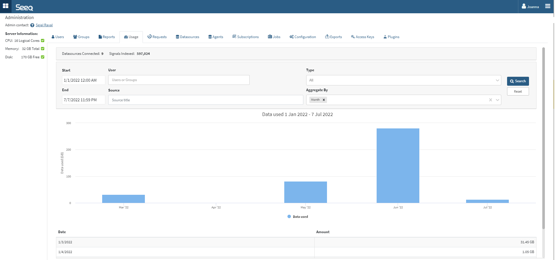
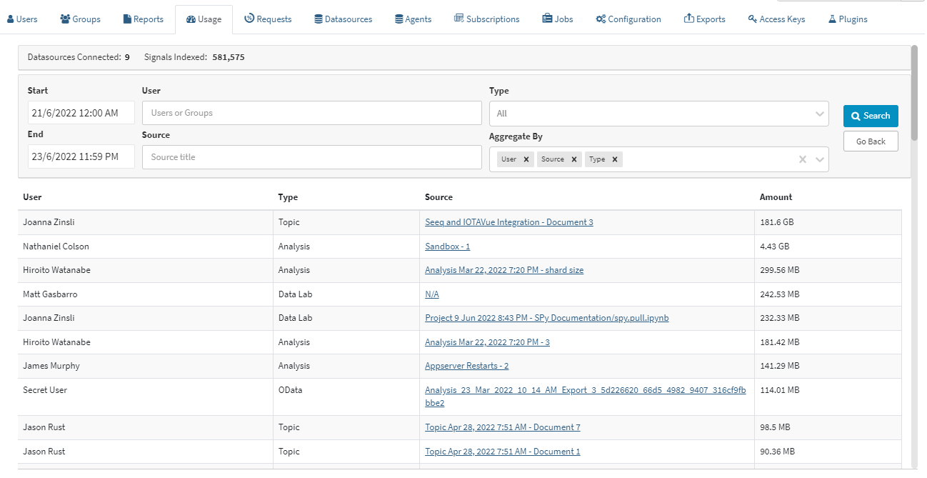
Navigate to the Usage tab on the Administration page. The default view is monthly over the last 6 months, but different start and end dates can be entered. Click into the Monthly or Daily columns on the chart to see more detail. Apply various filters or change the dates to further narrow how you view the data. Scrolling down from the charts will reveal a table displaying the data. The image below shows adding Type as an aggregation:
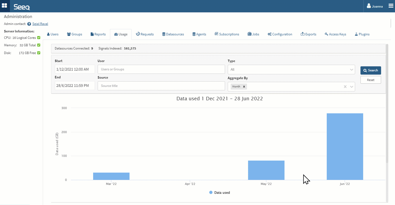
Charts will display when there are two or fewer aggregations. When three or more aggregations are applied, the data will display in a table. Bar charts will display when aggregation includes a date, otherwise a pie chart will display. The pie chart will show the top 10 and group all others in an “Other” category.
Sorting is by date as long as day or month aggregation are applied, or no aggregation is applied. When aggregating by something other than date, results appear sorted by usage amount.
Aggregation Types
Time - Month or day must be used independently of each other.
Source - Aggregate all data requested by each unique URL in Seeq. This might be a Worksheet, Topic Document, or Data Lab Project. The source is only recorded in R58 and later, so any data used prior to R58 will have N/A in this line. Going forward the source is also a link out to the item in view mode that used the data so you can see the latest state (date range, schedule, etc).
User - Aggregate all data requested by each authenticated user.
Type - Aggregate all data flowing through Analyses, Topics, OData queries, Data Lab or REST API queries.
The results are currently limited to 500 rows in this interface. Adjust filters or date ranges to have less than 500 rows to see a complete data set represented by the chart. A yellow triangle next to the Search button will indicate when this limit is reached.
The 500 rows will follow the above mentioned sort order, so worst offenders will appear at the top when looking across a user base of more than 500 users.
Examples of questions this interface intends to answer
Is our usage consistent or does it fluctuate?
Look at the default monthly view for consistency between months or choose a daily aggregation to see a daily trend over time.
What is the cause of big spikes in usage?
Looking at a daily trend, you may see a few days that have significantly more usage than others. You can add aggregation by User and Source to see who was using Seeq that day and which Workbook, Topic, or Project they were using to interface with Seeq.
Which people use Seeq the most?
Aggregating by user will reveal the users that consume the most data in Seeq. This could be with scheduled documents or scheduled notebooks that they may or may not open routinely. Cross checking with the Reports tab on frequency of schedules may be one thing to consider to mitigate high data usage.
Note that Organizer Topics use a configured account for access control of that Organizer. This defaults to the creator but can be edited on the Home Screen. Anyone who opens an Organizer Topic in Presentation, View Only, or Edit mode will appear as data used by that access control account. If the reading users make changes in View Only mode, they will initiate requests from their accounts and show on this list as using data from that Organizer Topic.
How Usage Data is Calculated
Every user-driven request that passes through Seeq is captured and summarized in one entry for each distinct user, source, type combination on a daily basis.
A single sample is worth 16 bytes and a single capsule worth 64 bytes.
Requests to any connected datasources (regardless of whether persistent caching is enabled) are included in this usage data.
There is a GET/ usage API endpoint that can be accessed using the SDK if enterprise administrators want to query and display Seeq usage data in another application.
This usage data is not the same as telemetry data, so any configuration changes on telemetry data will not impact this data.
Data Lab usage is measured in "Credits". The default Data Lab Project consumes 1 credit per hour and is measured in 1 second increments (0.01667 credits per hour). The credit consumption of other Data Lab Projects depends on their size, with larger projects consuming more credits per hour.
Data Usage Best Practices
There is not an expected amount of data that should be flowing through Seeq for any particular user. Data flow will vary day to day for ad hoc usage but can be anticipated, predicted, and managed for more routine monitoring workflows. Anticipate higher data flows when working with dense data, many assets, or data queries over long periods of time.
If you find some users are associated with much more data usage than others, consider linking them to Best Practices for Workbench Performance to ensure they are aware of techniques to consider to minimize large data pulls when navigating in Workbench. If these users are pulling more data than others through Organizer Topics, check on the Organizer’s update frequency and amount of content and work with them to reduce that frequency if necessary. See Managing Organizer Topics for more information on understanding which scheduled documents have not been accessed recently. These may be good candidates to disable and reduce unnecessary data flow.